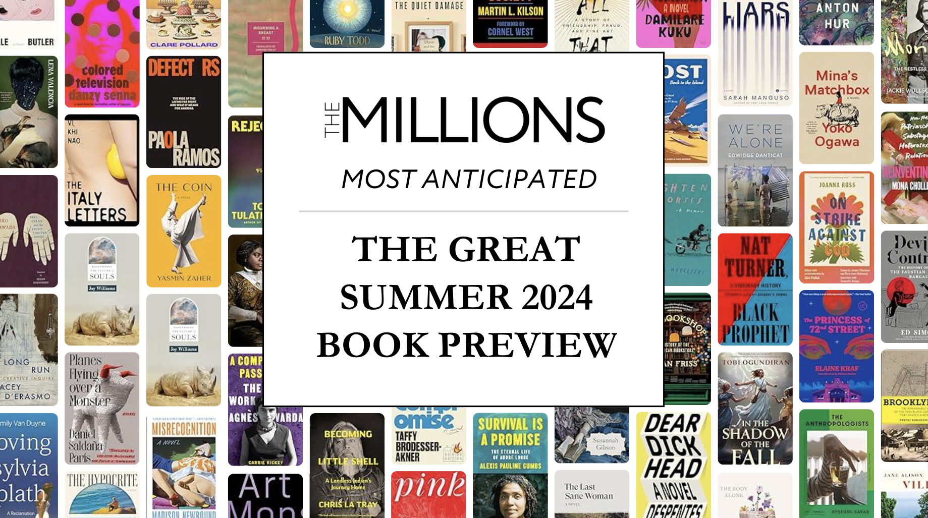
As we’ve done for several years now, we thought it might be fun to compare the U.S. and U.K. book cover designs of this year’s Morning News Tournament of Books contenders. Book cover art is an interesting element of the literary world — sometimes fixated upon, sometimes ignored — but, as readers, we are undoubtedly swayed by the little billboard that is the cover of every book we read. And, while many of us no longer do most of our reading on physical books with physical covers, those same cover images now beckon us from their grids in the various online bookstores. From my days as a bookseller, when import titles would sometimes find their way into our store, I’ve always found it especially interesting that the U.K. and U.S. covers often differ from one another. This would seem to suggest that certain layouts and imagery will better appeal to readers on one side of the Atlantic rather than the other. These differences are especially striking when we look at the covers side by side. The American covers are on the left, and the UK are on the right. Your equally inexpert analysis is encouraged in the comments.
 |
 |
| I much prefer the U.K. version here. The woodblock art is sublime, and the red and black are nice and bold. | |
 |
 |
| Both of these make great use of a wild ’70s aesthetic, but I like the subtle menace of the U.K. cover over the day-glo U.S. design. | |
 |
 |
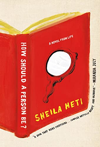
| The U.S. is my winner here with that intriguing and very “meta” book on a book design. The U.K. cover isn’t quite fully realized. | |
 |
 |
| Against any other cover, the clever ripped-and-repaired look of the U.K. design would be my winner, but I love everything evoked by that big can-shaped slab of gelatinous cranberry on the U.S. cover. | |
 |
 |
| The layered look of the U.S. cover is simply stunning and very evocative, while the U.K. cover falls prey to the all-to-common crutch of “Asian” themes adorning novels about Asia or by Asian authors. | |
 |
 |
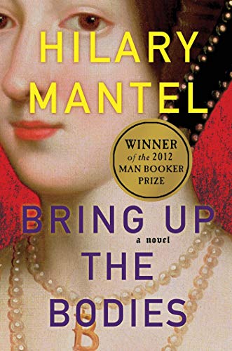
| Perhaps unsurprisingly, the U.K. covers for Hilary Mantel’s Cromwell books have far outshone the U.S. covers. The U.S. covers seem to lean heavily on the old “historical fiction” look. | |
 |
 |
| Speaking of historical fiction tropes, these both draw from the classic “a picture of something old from a museum” look. | |
 |
 |
| The U.K. version is stunningly bland, while I love the big-text-over-paint look of the U.S. cover. | |
 |
 |
| Now this is interesting: two different versions of the same idea. I think the U.S. cover pulls it off better. | |
 |
 |
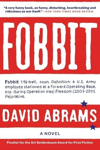
| There’s something more daring about the text-only, dictionary-definition U.S. cover, while the U.K. cover seems designed to signal very loudly that this is a war novel. | |
 |
 |
| This one’s a tie for me. I’m a sucker for the vintage text and graphics mash-ups. | |
 |
 |
| I don’t love either of these, but I think the painterly U.S. cover is better than the U.K. cover’s exploding flowers. | |