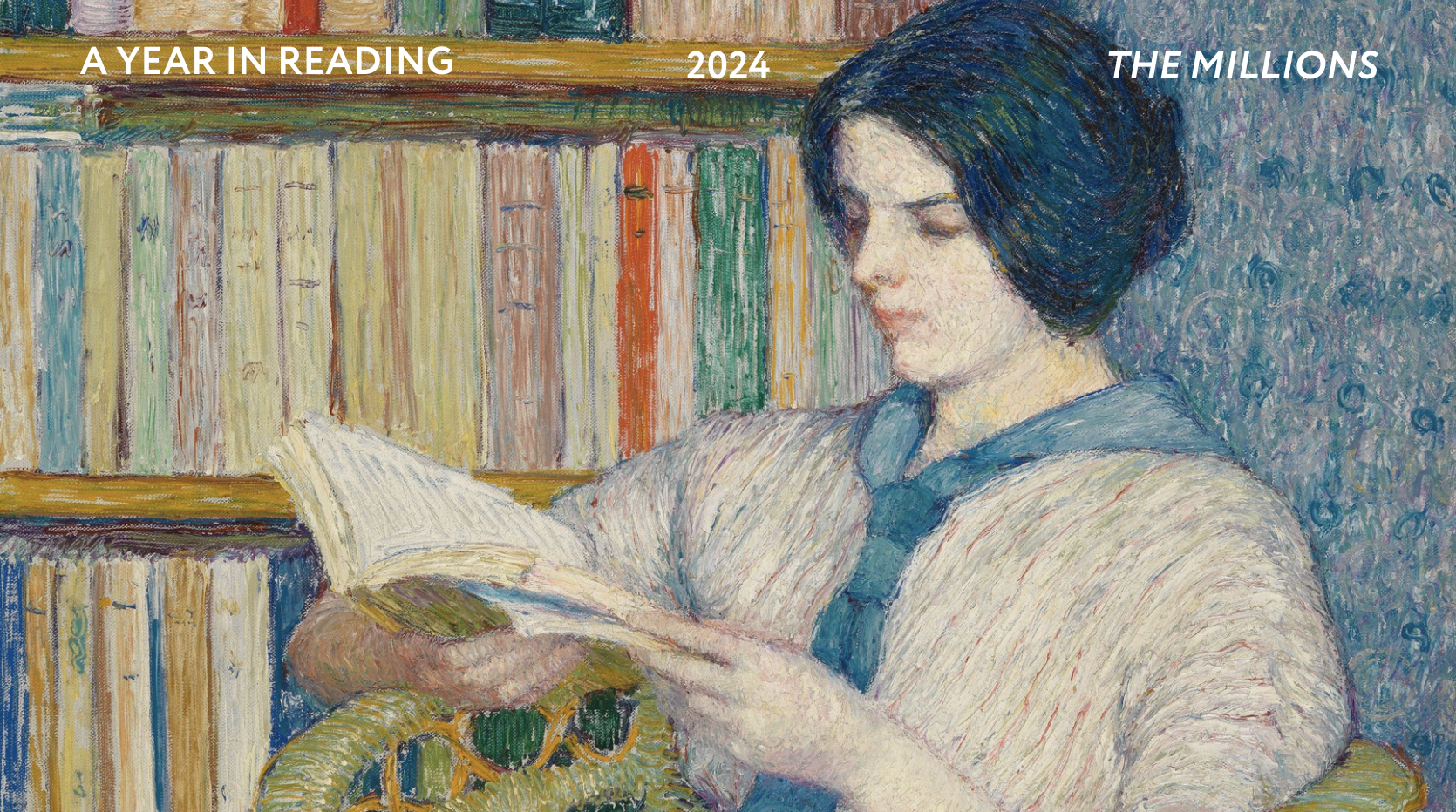
The London Book Fair starts on April 12th. As a kick off, we thought it would be fun to compare the U.S. and U.K. covers of a few notable titles from last year, a task previously taken on by our much-loved outgoing editor, Mr. Max Magee.
I’ve lived in both the U.S. and the U.K. and always felt that if I could pinpoint the reason why the soap operas are so different — the kleenex-lensed, pearly hues of The Young and the Restless vs. the gruff, flattened grays of East Enders as one example — or articulate why marmite sandwiches appeal in one place when peanut butter and jelly is preferred in the other, I would finally understand where the two cultures divide.
Sometimes I look to book covers in an attempt for clarity. Why is a cover in the U.S. replaced with another in the U.K. when the words inside are exactly the same? I may not like marmite, but I do have a taste for books. I sat down to see if I could finally develop the overarching theory that has eluded me so far.
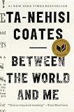
 It’s notable that many covers are the same. Some of the biggest books, like Helen Macdonald’s H is for Hawk, Ta-Nehisi Coates’s Between The World And Me, and Elena Ferrante’s Neapolitan novels sport the same jackets in the U.S. and U.K. “It often comes down to differences in cultures and tastes. What appeals to people in one country doesn’t appeal to others,” says my literary agent, Denise Bukowski. “But if the book has been published first in one country and has been successful there, subsequent publishers often choose to capitalize on that success by using the original cover.”
But many others titles still have completely different covers, which is fortunate as it means there is still plenty for us to argue about.
Below I present just a few of the choice examples. U.S. covers are on the left. U.K. covers are on the right. Your equally inexpert analysis, baseless opinions, and sweeping generalizations are encouraged in the comments.
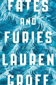

Fates and Furies by Lauren Groff
These covers are intriguingly similar and yet so different. Swirls vs. angles, blues vs. reds, swishes vs. swipes, almost like a mirror of the two halves of the book, the first told by the husband, Lotto, and the second by the wife, Mathilde. I had trouble making sense of it all until I consulted an article called “How to Use Color Psychology to Give Your Business an Edge” and understood that there is subliminal messaging at work. The U.S. cover designer is on team Lotto and emphasized blue for grief, sadness, and distraction. In the U.K., the designer was on Mathilde’s side, hence anger, rage, and ecstasy.

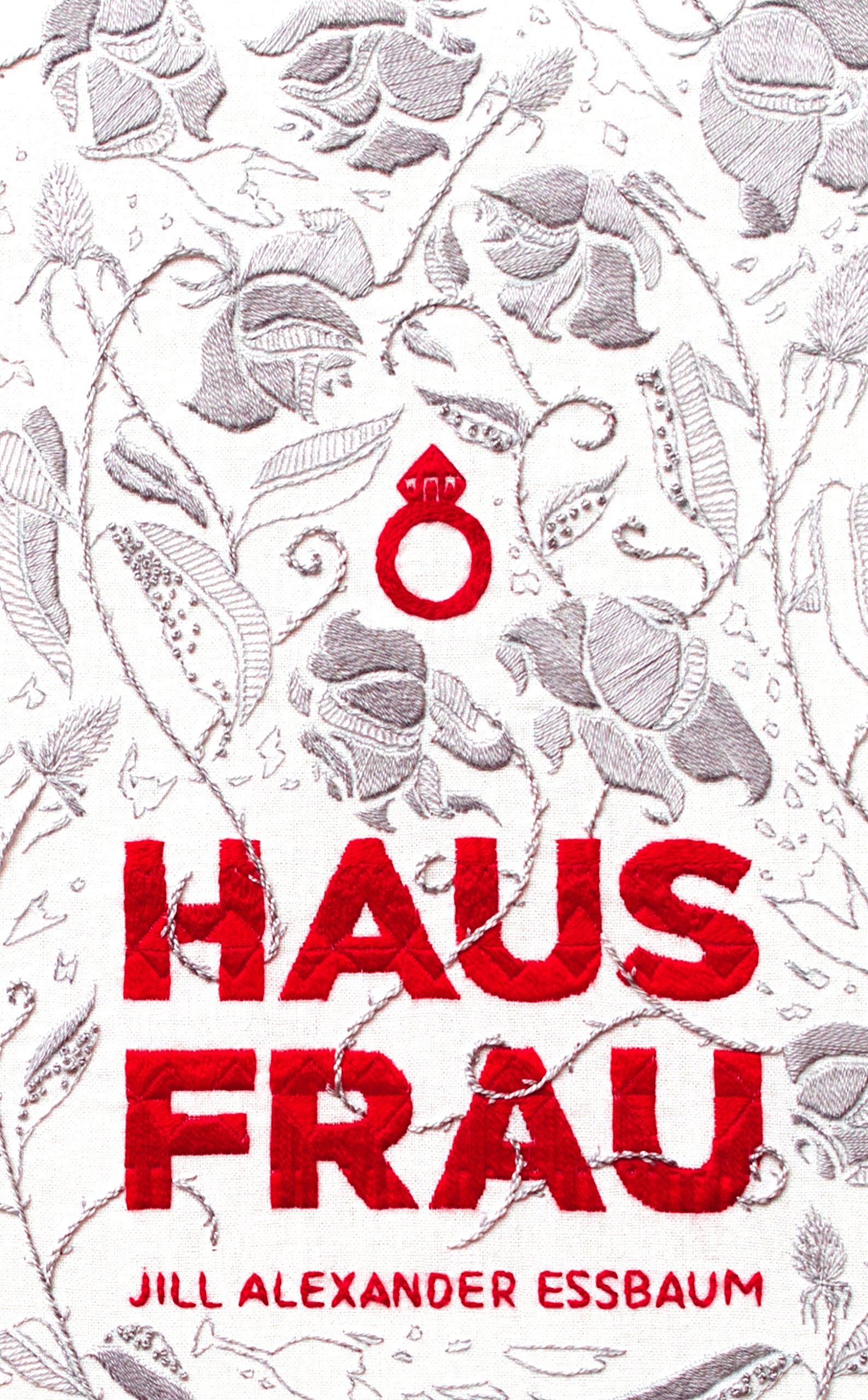
Hausfrau by Jill Alexander Essbaum
I love the U.S. cover for this book, but how does it relate to the story? Flowers are sex organs. This book is about sex organs. Then what of the U.K. cover — embroidery is about not having sex. Or not messy sex. Maybe strictly missionary? Or if you get up to more, you have to make the bed perfectly afterwards, including carefully smoothing the bedspread so that no one will suspect what you’ve been up to. Which is exactly what this book is about.
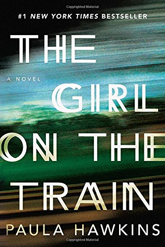

The Girl on the Train by Paula Hawkins
These two covers clearly illustrate one big difference between the two countries, their respective outlooks on the events leading up to the U.S. presidential election. If you are a drunk woman in the U.S., the primaries feel like you are on a train and with all the antics, both comic and tragic, hurtling around you in an incomprehensible blur. If you are a drunk woman in the U.K., you watch from the outside and find yourself unable to take your wavering eyes off the speeding train — the question that holds your attention is not if it will crash, but how.

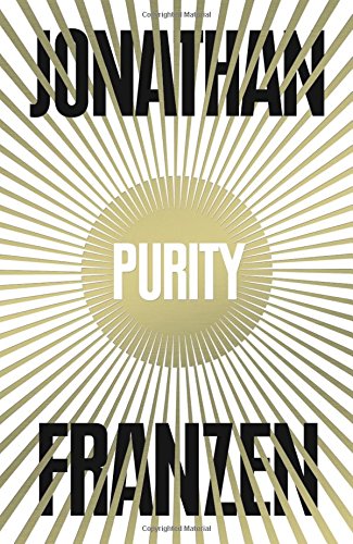
Purity by Jonathan Franzen
Only a fool would think these covers came from different countries. They were clearly designed in alternate dimensions.
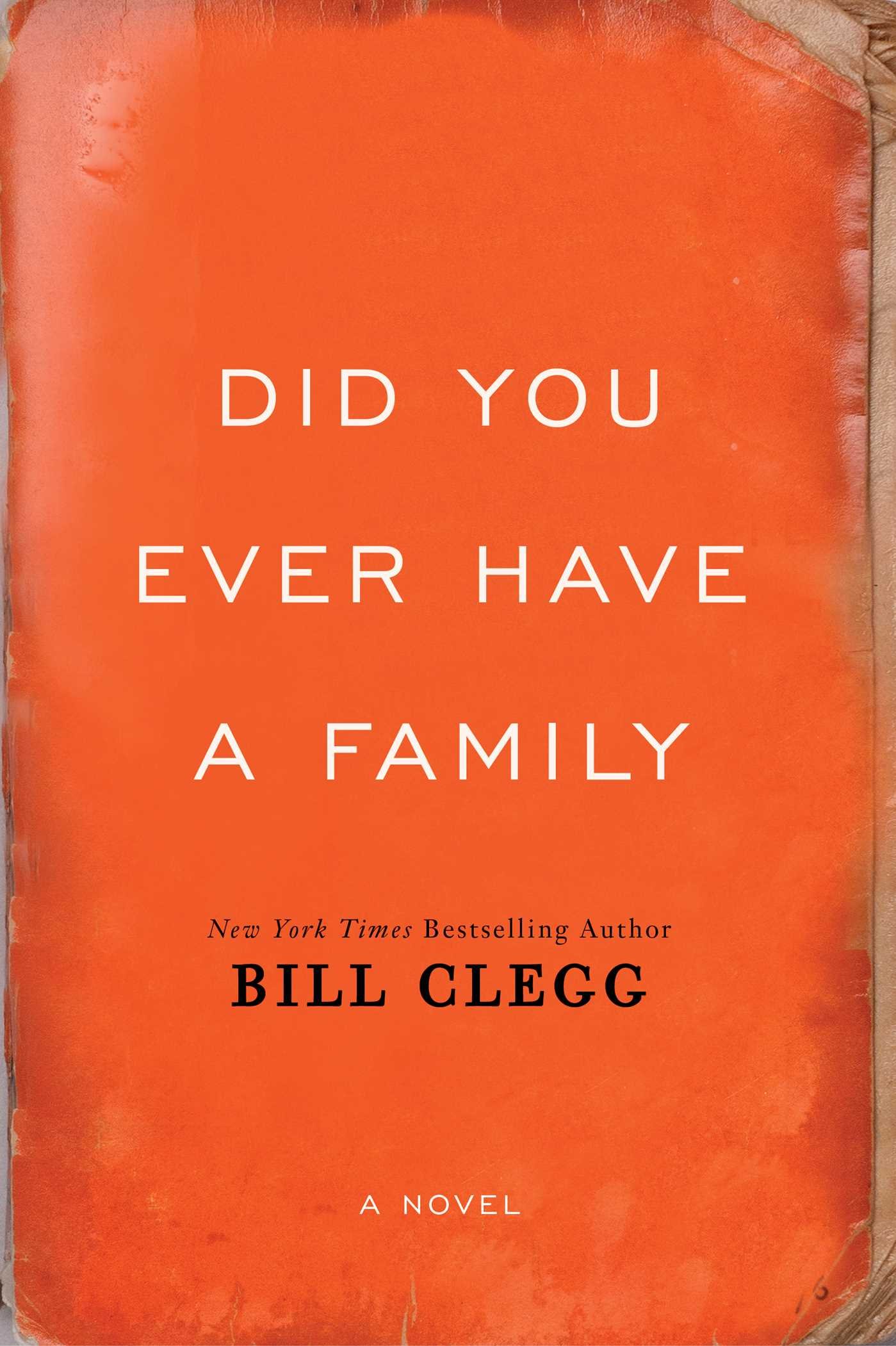
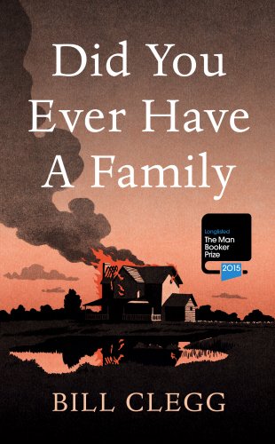
Did You Ever Have a Family by Bill Clegg
Both designs take inspiration from the publisher’s description of the inciting incident: “This book of dark secrets opens with a blaze.” However each seem to have decided that a different element of that incident is more enticing. In the U.S., readers might like dark, mildewy, water-damaged secrets, whereas in the U.K., a good house fire will make the book fly off the shelves?


A Little Life by Hanya Yanagihara
It’s hard for me to imagine A Little Life without the ecstasy and agony conveyed by the iconic photograph on the U.S. edition, Orgasmic Man by Peter Hujar. I was struck by ecstasy every time I picked up this book and collapsed into agony after each reading session. I understand the reasoning behind the U.K. cover; it makes sense to put forward an image that evokes life in New York, but it doesn’t echo the experience in the writing, as does Hujar’s art. I wonder, are orgasms not a universal experience? Perhaps people in the U.K. do not have them.


Go Set a Watchman by Harper Lee
Finally, the clarity I seek. This one is straightforward. The U.S. cover lets you know the name of the book you are buying. The U.K. cover lets you know that you are buying a draft of a sequel that you won’t enjoy unless you keep To Kill a Mockingbird in the back of your mind at all times while reading.