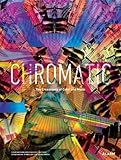
As the art director at Columbia Records in 1940, Alex Steinweiss came up with the idea of designing record sleeves to be more than plain monochromatic paper wrappers, solidifying the longstanding relationship between music and color. When Steinweiss added visual flourish to the packaging of music, Columbia’s sales skyrocketed, converting innovation into a market necessity. Since then, countless books about album covers, packaging design, and color have been published. Chris Force and Scott Morrow, the editors behind Chromatic: The Crossroads of Color and Music have put together a survey of how contemporary musicians and designers perceive and are inspired by the union of music and color, from elements of graphic design to dramaturgy.
 In the book’s introduction, Morrow makes it clear that Chromatic is not meant to be comprehensive. How could it be? Since Steinweiss’s first offering of album art — a glitzy theater marquee trumpeting an orchestral recording of Rodgers and Hart songs — there isn’t a musician in the world who has performed in public and not given color some consideration, whether in terms of what to wear, DIY photocopied show posters, or slick merch. In truth, there is really no way to separate music and color, which makes the book incredibly interesting, and at times mildly frustrating.
It feels as if certain musicians have been shoehorned into the book for questionable associations with the theme of color, such as the band Dark Dark Dark. Compared to other bands that explicitly utilize color to make a point, as documented in Chromatic’s ample visual content, Dark Dark Dark seems to be included by virtue of its name; in a sunny outdoor space that can’t decide whether it’s a junkyard or art installation, the band’s five members pose in the standard untucked slim-fit uniforms of indie rock, trying to decide whether they are brooding or just bored. This is not to say the band isn’t good — it is — but in the book’s context, its presence distracts from those actively incorporating color into their musical output. Luckily, Chromatic is just shy of 400 pages and the majority of the content provides a great deal of insight into the processes of manipulating waves of sound and light.
Mathias Augustyniak says of designing Björk’s Volta, “Each time we do an album for Björkk, it’s like doing a portrait of her . . . she sort of has a new personality for each album. All of those personalities complement each other or contradict each other; they make sense within a line of characters. But each time, we have to do a new portrait.” Most of the featured artists in Chromatic are not as famous as Björk, but on some level they all share in this approach. Individual songs are not necessarily the purpose of making music for these artists; they are crucial but not exclusive elements in bodies of work that are meant to elicit sensations that you hear, feel, and see as a whole.
Take for example Timothy S. Aames’s account of how the charred remains of the Deyrolle taxidermy shop in Paris connect to the set design for a tour by Sigur Rós frontman Jónsi. From a book of photographs to full-blown multimedia spectacle, Aames reveals how Jónsi and Fifty Nine Productions brought to fruition something neither party had imagined until collaborating on the presentation of a narrative arc built of music and color.
Jessica Steinhoff’s overview of synesthesia, a neurological condition in which the stimulation of one sense triggers an involuntary sensation in another sense, is among the most interesting sections of Chromatic. There is a long history of people seeing colors when they hear music, including composers Franz Liszt and Jean Sibelius, as well as Duke Ellington and Robyn Hitchcock. Steinhoff’s gloss of the phenomenon is full of entertaining anecdotes and first-hand accounts of how one sees music. For Greg Jarvis, from The Flowers of Hell, colorless “shapes float above the sound’s source, with high-pitched notes creating shapes high in the air and the shapes of bass-register notes almost scraping the ground.”
Many of the featured designers and artists have musical backgrounds, making for explanations that far exceed what you would hear in a graphic design class. Andy Gilmore, whose fractal repetitions of color have earned him commissions from the likes of The New York Times and Wired, views “the CMYK color process as each color being a note . . . like these stacked values of these tones, so when I make an image, the computer-based imagery, I kind of distribute value in a way that I can create a melody. I view each individual value as kind of its own pitch.” The creations of Sam Blunden, Seripop, Walter Scott, and Lisa Czech are singular voices in a motley chorus of color and form that make you forget about music.
In his introduction to Chromatic, Morrow writes, “As human beings, we are fortunate to be trichromats — organisms with three types of color-receptor cells. . . This allows us to differentiate approximately 1 million colors.” It’s no wonder we are such subjective beings, especially when it comes to issues of personal taste. Chromatic is as much about the editors’ taste in music as it is about color. If you don’t like Force and Morrow’s taste it doesn’t matter; the book is a riot of ideas sure to engage anyone interested in visual communication.
Truly interesting is that so many of these musicians embody Richard Wagner’s 19th-century notion of Gesamtkunstwerk (“ideal work of art”), the fusion of visual art with drama, music, and poetry. Chromatic is a first in the way it documents a segment of today’s music scene by favoring exciting and important visual examples that contribute to a sensory overload that better represents the music than words or notes ever could on their own.
Image Credit: Flickr/Creativity103


