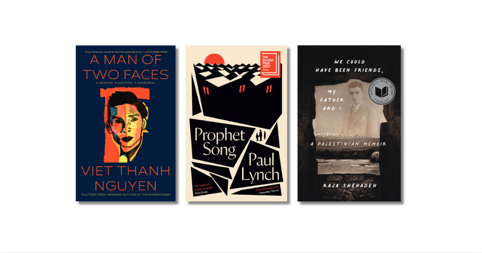
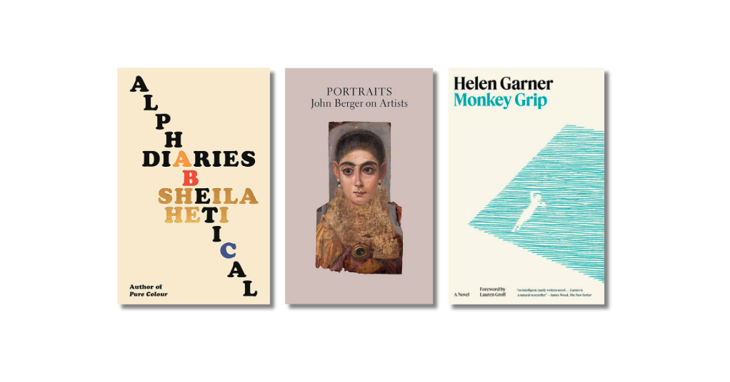
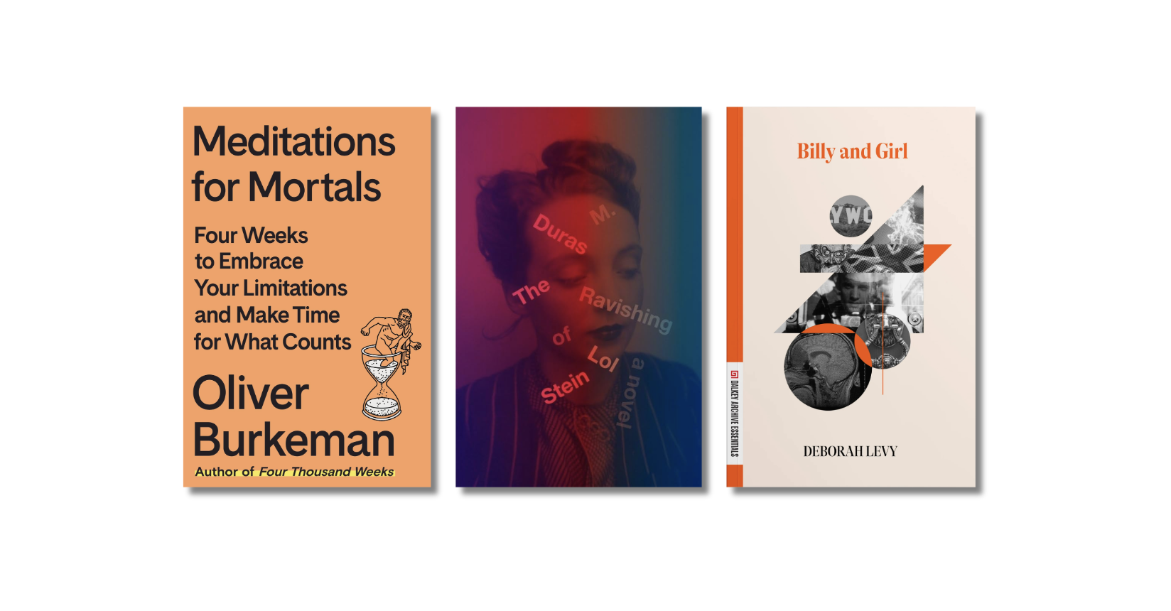
As we’ve done for several years now, we thought it might be fun to compare the U.S. and U.K. book cover designs of this year’s Morning News Tournament of Books contenders. Book cover art is an interesting element of the literary world — sometimes fixated upon, sometimes ignored — but, as readers, we are undoubtedly swayed by the little billboard that is the cover of every book we read. And, while some of us no longer do all of our reading on physical books with physical covers, those same cover images now beckon us from their grids in the various online bookstores. From my days as a bookseller, when import titles would sometimes find their way into our store, I’ve always found it especially interesting that the U.K. and U.S. covers often differ from one another. This would seem to suggest that certain layouts and imagery will better appeal to readers on one side of the Atlantic rather than the other. These differences are especially striking when we look at the covers side by side.
The American covers are on the left, and the UK are on the right. Your equally inexpert analysis is encouraged in the comments.
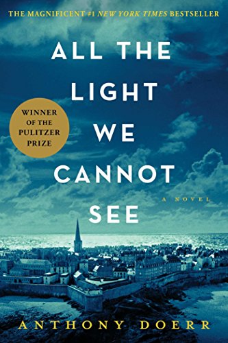 |
 |
| Neither of these is especially appealing to my eye. The U.S. version uses a travel poster-type image, but at least the bold font and title placement are intriguing. The U.K. goes for realism and the result is pretty dull. | |
 |
 |
| Another pair that I don’t love, though the U.S. version has an appealing painterly quality to it. The U.K. version feels a bit slapped together. | |
 |
 |
| I like both of these a lot. The U.S version is bold and somehow feels both vintage and very current. The LP label motif in the U.K. version is clever, yet subtle enough to avoid being gimmicky. | |
 |
 |
| The U.S. version does a great job of setting a mood, but my nod goes to the U.K. version. The black dog is eerie and sculptural and the receding landscape is haunting. | |
 |
 |
| These covers are very different and I have loved them both since I first saw them. The tents on the U.S. cover are both magical and, in the context of the subject matter, unnerving. But I love the bold, poster-art aesthetic of the U.K. cover too. | |
 |
 |
| Sometimes simpler is better. I like the mesmerizing quality of the U.S. cover, with the tantalizing golden apple peeking from its center. The U.K. version is clearly trying to capture the mad tumult of the book’s plot but it is somehow too literal. | |
 |
 |
| The U.S. cover is clever and intriguing, with those circular windows on repeated words, but I love the U.K. cover and the subtle suggestion of madness in its Jenga/Tetris puzzle. Update: I had initially posted the paperback U.S. cover, but looking now at the hardcover design, I agree with our commenter Bernie below that it is very striking. | |
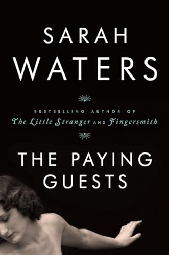 |
 |
| The cropping of the sculpture gives the U.S. cover a compelling look. I like the U.K. cover but it doesn’t feel quite fully realized. | |
