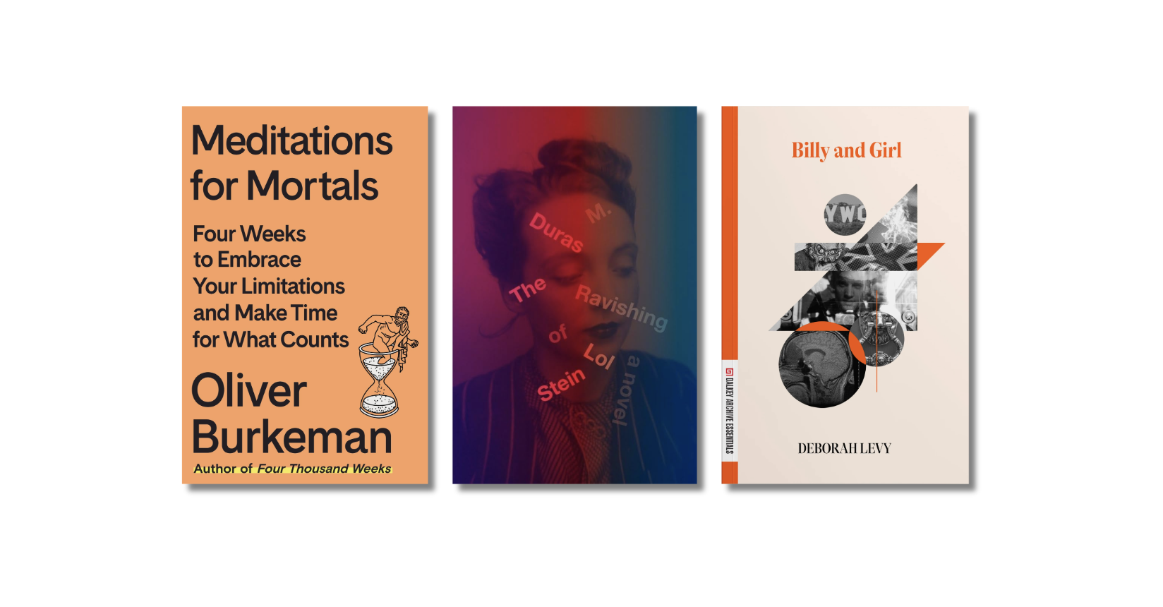
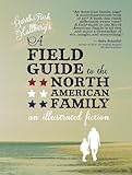
 A little over three years ago, in a fit of apparent insanity, a New York-based independent press bought a sizeable chunk of the short-story collection I’d been working on and published it as a stand-alone volume. I remain proud of the book, A Field Guide to the North American Family, which was reissued last month in paperback. A lot has changed since the end of 2007, though, and the new edition has me thinking again about a couple of misapprehensions I was laboring under at the time of its writing. The first was that inserting an “illustrated fiction” into an otherwise un-illustrated cycle of stories was just the thing to ignite the bidding war that would make me a millionaire. (Thanks a lot, W.G. Sebald!) The more important, related misapprehension, though, has to do with “the future of the book.”
 In college, I had been an extracurricular binge-reader of 1960s and ’70s “experimental” literature, in secret rebellion against the masterpieces-only Atkins diet that comprised my coursework. Even in my mid-twenties, I was convinced that the novel of the future would incorporate as much Cortazar and Cather, as much Willie Masters as Wilhelm Meister. History had different ideas, as usual. Two weeks after my exuberantly book-y book came out – replete with color photography and typographic mayhem – Amazon launched the first Kindle, which sold out in less than a day. The book of the future, it turned out, had a built-in battery. And what I’d just published would never work on it.
Then again, as my therapist suggests (though my accountant begs to differ) maybe this accidental Kindle-proofing is a blessing in disguise. My nostalgia for print, after all, is something like Balzac‘s for the wooden printing press in Lost Illusions:
At the time when this story opens, the Stanhope press and the ink-distributing roller had not yet come into use in small provincial printing-houses…. [Now] the rapid spread of machine presses has swept away all this obsolete gear to which, for all its imperfections, we owe the beautiful books printed by Elzevir, Plantin, Aldus Didot, and the rest…
In the novel that follows, Balzac links speedier and more efficient printing technology, and the larger cultural pressures it stands for, to the artistic failures of his would-be hero, the “provincial” Lucien Chardon. Unable to withstand the allure of a fast franc, Lucien becomes in Paris whatever is French for “sellout.” (Not to mention – horrors – a critic!) But I would become no Lucien Chardon – not with Field Guide, anyway. To “sell out,” you first have to sell, and in committing to the ideal of the “beautiful” book, I had pretty much guaranteed that this particular project would remain unsullied by commerce.
Now, in honor of the future that never was, the durable pigments of the almost obsolete, I offer you the following trade secrets to fellow writers. The availability for the Kindle of some of the titles mentioned below points to the difficulty of the task; nonetheless, here are:
Seven Ways to Kindle-proof Your Book
 Step 1. Use Color
The iPad and Barnes & Noble’s NookColor have already gone some way toward countering this strategy, and Amazon is rumored to have plans to follow suit with a full color, full-functionality tablet. As of this writing, however, the top-selling eReader, the Kindle, remains a black-and-white only affair. I suggest, then, that all of you aspiring Kindle-proofers out there familiarize yourselves with the color palette on your word-processors. You may, as Mark Z. Danielewski does in House of Leaves, choose to assign a single word its own color, like the sodapop in the old Cherry 7-Up commercials. (Isn’t it cool…in pink?) Or you may opt for a subtler approach, à la Richard Flanagan. In Gould’s Book of Fish, Flanagan uses a different color for each chapter, to represent the different dyes employed by his ichthycidal narrator. Still not persuaded? I once heard that Faulkner planned to use different-colored type to distinguish the different voices in As I Lay Dying. If it’s good enough for a Nobelist, isn’t it good enough for you?
 Step 2. Illustrate, Illustrate, Illustrate
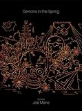
In an essay published in The New Yorker a couple years back, Nicholson Baker complained that “photographs, charts, diagrams, foreign characters, and tables don’t fare so well on the little gray screen” of the Kindle. Of course, as with Step 1, the iPad complicates things, and glossy (“glossy”?) magazine readers are apparently “flocking” to the NookColor. (Constant vigilance is the price of Kindle-proofing!) But it’s worth pointing out that, where words on a page are an abstraction of an abstraction, illustrations are only one representative step away from the visual world. And so the venerable tradition of the illuminated manuscript still seems to favor, at this stage of the game, the codex book. No wonder that, as writers grow anxious about the fate of print, we’re seeing an uptick in illustrated fiction; it’s the literary equivalent of abstract painting’s retort to photography. (This is to say nothing of graphic novels.) Lavishing attention on hand-made illustrations – as in Joe Meno‘s Demons in the Spring – or incorporating photographs, like Rod Sweet and Tim Williams‘ Instructions for the Apocalypse or Leanne Shapton‘s Important Artifacts, is a great way to add an extra exclamation point to your literary pooh-poohing of the eReader.
 Step 3. Play With Text, Typeface, and White Space
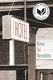
eReaders currently use two approaches to rendering text. One is quasi-photographic, but the Kindle’s remains the more battery-efficient method of imposing a standard typeface. This makes the effects of a textually playful book like Danielewski’s House of Leaves or Karen Tei Yamashita‘s I Hotel or William H. Gass‘ The Tunnel – difficult to render on a Kindle. If you want to up the degree of difficulty, you can try combining this with step 1, following Gass’ lead in Willie Masters’ Lonesome Wife, wherein text in a range of typefaces and sizes curves and distends and floats around and behind the illustrations. And then there’s white space. Mallarmé may have got there first, but Blake Butler‘s There is No Year is moving the ball forward. It’s available for Kindle, but only the good Lord and Jeff Bezos know how it reads there. (I don’t think I need to point out the irony of the Amazon customer review for A Visit from the Goon Squad that finds “the ‘powerpoint’ chapter…extremely difficult to read on the Kindle.”)

 Step 4. Run With Scissors
The opening story of John Barth‘s Lost in the Funhouse, famously invites readers to take scissors to it and create a Mobius strip. This cut-up aesthetic is more literal in Jonathan Safran Foer‘s Tree of Codes, which slices and dices the pages of Bruno Schulz‘s Street of Crocodiles to create pages like lace. It’s a piece of found prose-poetry whose sentences change as you turn the page. Except on the Kindle, where it doesn’t – and couldn’t – exist.
 Step 5. Go Aleatory
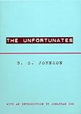
Narrative fiction, as Vladimir Propp would tell you, need not proceed in a straight line. Presumably, the HopScotching of Cortazar’s Rayuela would be easy enough to approximate via hyperlink on a Kindle, as might something structured like Raymond Queneau‘s “A Story As You Like It.” But what about a story where the order of the pieces genuinely doesn’t matter. Or one where an Oulippan element of chance is built in? A narrative like Coover’s “deck of cards” story from A Child Again, say. Or B.S. Johnson‘s The Unfortunates, which consists of a beginning, an ending, and 25 middle chapters to be shuffled and read at random. Speaking of The Unfortunates…
 Step 6. Put It In A Box
Gass at one point imagined reinforcing the random, “pile of pages” aspect of The Tunnel by printing it loose-leaf and selling it in a box. It can’t be any coincidence that, in the age of the Kindle, the book as boxed set has been making a comeback. New Directions, in addition to The Unfortunates, has given us the slipcovered (and thus far unKindled) Microscripts of Robert Walser. McSweeney’s, another box-loving press, has delivered any number of issues of the Quarterly, not to mention One Hundred and Forty Five Stories in boxed form. And in 2008, Hotel St. George Press published Ben Greenman‘s archetypally box-intensive Correspondences, albeit in a limited edition.
 Step 7. Pile on the End Matter
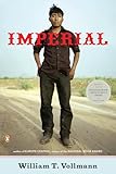
This strategy exploits not so much a technical weakness of the Kindle as a practical one. My theory is that, because the number of pages remaining in a book aren’t palpable on a digital device, readers are less likely to go digging around in appendices, acknowledgments, and so forth. The endnotes function on the Kindle apparently makes it pretty easy to jump from the main text to the famous fine print of Infinite Jest. But with other kinds of end matter, aren’t you likely to hit “The End” and think: I’m done? Writers who sneak interesting and potentially meaningful information into the back of the book are thus a step closer to Kindle-proofing than the rest of us. Here I’m thinking specifically of William T. Vollmann, whose resolutely booktacular books often contain dozens, even hundreds of pages of end matter (interesting in direct proportion to the interest of the main text.) Or Walter Benjamin‘s Arcades Project. But I was struck, reading Georges Perec‘s Life A User’s Manual this spring, by the way the various indexes and appendices offered a variety of possible reformattings of the main text.
Bonus List: 10 Pretty Damn Kindle-Proof (at least, as of this writing) Books:
1. Nox, by Anne Carson (Rules Exploited: 1, 2, 3, 6): In many ways, this boxed version of a mourning journal Carson made after the death of her brother is the paragon of the Kindle-proof book: a book built out of books, and alert to its own status as an object.
2. The Original of Laura, by Vladimir Nabokov (Steps Taken: 1, 2, 3, 4, 5): The chief attraction of this slender posthumous work is its Chip Kidd design, which invites readers to cut out facsimiles of the notecards Nabokov composed on and make their own book…though, given the $35 cover price, I can’t imagine too many readers took Kidd up on it.
3. A Field Guide to the North American Family, by yours truly (1, 2, 3, 5): This is probably the only excuse I’ll ever have to insert my name in a list between Nabokov’s and Jonathan Safran Foer’s. There. I’ve done it.
4. Extremely Loud and Incredibly Close, by Jonathan Safran Foer (1, 2, 3): A Kindle version of Extremely Loud and Incredibly Close actually exists, but, even if Amazon were to insert an animation, there is just no way to achieve in e-form the flip-book effect on which this novel’s conclusion rises…and falls.
5. The Principles of Uncertainty, by Maira Kalman (1, 2): Okay, this is actually pretty easy to recreate on an iPad. But who would want to read this gorgeous thing on a screen?
6. Dictionary of the Khazars, by Milorad Pavic (5): The chief Kindle-resistant feature of Dictionary of the Khazars is that it is actually two books: a “male version” and a (slightly different) “female version,” bound back to back. You move from one to the other by flipping the book over and starting from the other end. Kindle that, Amazon!
7. Only Revolutions, by Mark Z. Danielewski (1, 3, 5): Unlike House of Leaves, the National-Book-Award-nominated Only Revolutions is too insanely Kindle-proof to actually be a good book. I found its main text – which takes the flip & read logic of Pavic a step further – to be a hackneyed pastiche of Finnegans Wake. But you can’t blame a guy for trying.
8. One Hundred Thousand Million Poems, by Raymond Queneau (4, 5): This echt-Oulippan “poetry machine” is a set of 10 sonnets, bound to a spine, but with incisions between the lines that extend out to the edge of the page. Readers can manipulate the pages to form and reform sonnets. Mathematically, there are 1,000,000,000,000,000 possible variations. In theory, an eBook equivalent of this would work beatifully (you’d just have to build in a “shuffle” function) – though by equivalence rather than reproduction.
9. Rising Up and Rising Down (the unabridged version), by William T. Vollmann (2, 3, 5, 7): In theory, this should be the perfect eBook candidate, in the sense that no one wants to lug the damn thing on the subway. It is, in a sense, almost all appendix. I’d bet dollars to donuts, though, that, via the logic sketched in point 7 above, no one would ever get through a digital edition. Vollmann’s detractors would argue that’s a good thing. I’m not so sure…
10. Where the Wild Things Are, by Maurice Sendak (1, 3): The brilliance of Where the Wild Things Are, as a children’s librarian once pointed out to me, is not just the illustrations, but the way they gradually expand to fill the page spreads (what’s called a full-bleed)…and then recede again into white space. It enacts for children the dialectic of wildness and safety that is the book’s explicit subject, and has, this librarian insisted, a deeply therapeutic effect. Wild Things, that is, uses its book-ness beautifully. You could reproduce this on a screen…but unless the aspect ratio was 2:1, it would have to be in thumbnail form. Perhaps the solution, as Reif Larsen has suggested, is to get away from the idea of reproduction altogether. Rather than deluding ourselves that the eBook is a book, we should think carefully about the effects each can achieve that the other can’t, and then work to find equivalents between them. And lo and behold, a fantastically inventive app of Larsen’s The Selected Works of T.S. Spivet (Steps Taken: 2, 3) is now available for the iPad…perhaps pointing the way to yet another future of the book.
