1.
Writers, praise the typographers and designers: our words are in their hands.
2.
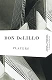
Bookshelves line the walls of my office. The room is small, and with the door closed, it feels comfortably claustrophobic with words. Lately my twin daughters pull books from the bottom shelves. They laugh while forming piles of prose and poetry. Transformations by Anne Sexton is splayed next to The Origin of the Brunists by Robert Coover, which smothers The Comedians by Graham Greene. My girls smile, then run away while I assess the wreckage. While returning the books to the shelves, I found Players by Don DeLillo opened to “A Note on the Type.” A colophon.
3.
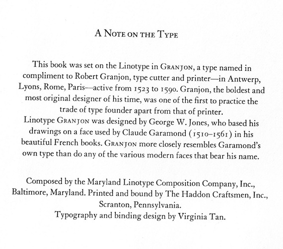
Colophons are sometimes the last words of books; the Greek origin of the word means “finishing stroke.” They are the end credits of literature. Colophons are the ticket out of the imagined world and back to the world of late trains and heating bills. Although often formal and informative, colophons are also peppered with personality. Handwritten colophons first appeared in 6th century manuscripts. The first printed colophon appeared in the second book printed by movable type, the Mainz Psalter, created by Johann Fust and Peter Schoeffer in 1457. The original colophon appears below, in Latin. Here is the translation by Douglas C. McMurtrie, from his comprehensive history: The Book: the Story of Printing & Bookmaking.
The present copy of the Psalms, adorned with beauty of capital letters, and sufficiently marked out with rubrics, has been thus fashioned by an ingenious invention of printing and stamping without any driving of the pen, and to the worship of God has been diligently brought to completion by Johann Fust, a citizen of Mainz, and Peter Schoeffer of Gernsheim, in the year of the Lord 1457, on the vigil of the Feast of the Assumption.
4.
Three years later, the colophon for Catholicon, a 13th century Latin dictionary written by Joannes Balbus, asserts it was printed “without help of reed, stylus, or pen, but by the wondrous agreement, proportion, and harmony of punches and types.” Wonder. Harmony. Letters.
5.
 Players was published by Alfred A. Knopf in 1977. Fifty years earlier, an essay “Cult of the Colophon” appeared in Publishers Weekly. Skillin & Gay’s Words into Type notes that “In the early days of bookmaking, the colophon appeared on the last page of the book and gave most of the details now shown on the title page,” which accounts for the word’s other usage “for publisher’s device, trademark, or symbol” — elements that have now migrated from the end of the book to the spine and title page. Think The Modern Library colophon of a torchbearer. Jay Satterfield notes the “colophon’s twentieth-century revitalization as a quality trademark was symptomatic of literature’s commodification, although it drew on a tradition of fine printing consciously detached from commercial interests by its aesthetic progenitors.” Usage of colophons “by trade publishers illuminates a modern melding of interests: publishing sought to maintain an air of disinterested dignity associated with art and literature, yet also yearned for sales potential modern commercialization promised.”
6.
Knopf said “a good-looking and well-made book will never do its author any harm anywhere at any time.” He attracted some of the nation’s finest typographers, although in Beauty and the Book, her consideration of fine book ownership in America, Megan Benton shows how some of those typographers thought that the Knopf colophons were “contrived.” William Addison Dwiggins, who coined the term “graphic designer,” said colophons were “shop talk.” He thought that readers “don’t care to know and they don’t need to know.” Benton also quotes Carl Rollins, who thought colophons were appeals to a book “buyer’s vanity;” a form of “free advertising for the paper merchant, the edition binder, the man who cast the rollers, and the provenance of the pressman’s pants.”
7.
Through her particular consideration of finer texts, Benton notes that 20th-century colophons served two purposes. The first appealed to the “growing number of bibliophiles who were knowledgeable or at least curious about the particulars of bookmaking.” From a marketing standpoint, colophons “shrewdly enabled publishers to point out the craft-based aspects of production that distinguished fine bookmaking from ordinary:” the eternal tension of the book as art and product.
8.
Players begins with an unidentified character’s speech, but quickly fades into the preparation for an in-flight movie. As the plane’s lights dim and the piano bar becomes still, the passengers seem to realize “for the first time how many systems of mechanical and electric components, what exact management of stresses, power units, consolidated thrust and energy it has taken to reduce their sensation of flight to this rudimentary tremble.” How beautiful, really, that only “One second of darkness” is “enough to intensify the implied bond which, more than distance, speed or destination, makes each journey something of a mystery to be worked out by the combined talents of the travelers, all gradually aware of each other’s code of recognition.” An appreciation for type is acknowledgment that good design enables enjoyment. The “one second of darkness” that is the union of reader, writer, and designer creates a form of literary communion.
9.
When asked about the “raw materials” of his fiction, DeLillo thinks small. “I construct sentences,” he says, with the ritual sense of the Latin Mass of his youth. He continues: “There’s a rhythm I hear that drives me through a sentence. And the words typed on the white page have a sculptural quality. They form odd correspondences. They match up not just through meaning but through sound and look.” DeLillo says he is “completely willing to let language press meaning upon me.” Press, of course. Letters pushed into the page. A mark, a tattoo, a scar. He concludes:
Watching the way in which words match up, keeping the balance in a sentence — these are sensuous pleasures. I might want very and only in the same sentence, spaced a particular way, exactly so far apart. I might want rapture matched with danger — I like to match word endings. I type rather than write longhand because I like the way the words and letters look when they come off the hammers onto the page—finished, printed, beautifully formed.
10.
Remember that books are crafted. Remember that books are words, words, words.
11.
When writing about books — a world within a world — I always feel as if I am writing to save something. I might attribute this salvific sentiment to the self-importance all writers suffer from, the feeling that we are saying something worth noting. Or the origin might be my Catholic sense, the wish to transform and transfigure. Either way, a comparably venial sin in the service of something greater.
12.
I spoke with Leah Carlson-Stanisic, associate director of design for HarperCollins, who thinks the decision to include a colophon is an important one, “because book publishing isn’t just the making and selling of something for the sake of consumerism.” Colophons — and the spirit behind them — are particularly essential now “during an important transitional period in terms of technology and how it is ever affecting our world and my industry.” In that vein, the colophon is a way to “reference and remember” the typographical tradition.
13.
I am less than a novice in terms of design. My experience is confined to one undergraduate course, a few months of introductory work with weeks devoted to typography. I remember zooming in on the contour of letters, and how that closeness felt like looking into someone’s eyes. Afterward, I browsed books in the university library. A bit embarrassed, I found a study room tucked in the upper floor, and nearly put my face in books. I was convinced that I had discovered something new.
14.
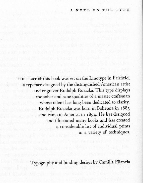
I love the right-justified colophon of Knopf’s The Stories of John Cheever. It looks like a pared wing. Part of a George Herbert poem.
15.
Carlson-Stanisic explained her method in selecting a typeface. Historical Fell or Tribute might be appropriate for a manuscript dated by time period: both “are heavy and ornamental.” If a manuscript “is dense with elements [such as] lists, dialogues, e-mails,” she selects a “clean font with very crisp, readable serifs, that has a variety of weights so that I can distinguish all of the elements.” And “I always want a font that has a beautiful italic. I am a snob that way.” Beyond content translated to form, Carlson-Stanisic stresses the need for clarity: “If you set the leading too tight, and the lines are too close together, the page will overwhelm you. I want to select a typeface that is proportional, isn’t too fine but certainly not bulky, and that doesn’t have anything too stylistically unique about it that certain characters stand out too much and distract.” Her ideal is “a beautiful workhorse with an elegant italic.” Her favorites: Fournier, Filosofia, Perrywood, Garamond.
16.
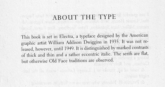
William Addison Dwiggins, for all of his aforementioned reservations about reader interest in colophons, is noted in many. My copy of Circling the Drain, the only book by Amanda Davis, ends with a terse colophon.
17.
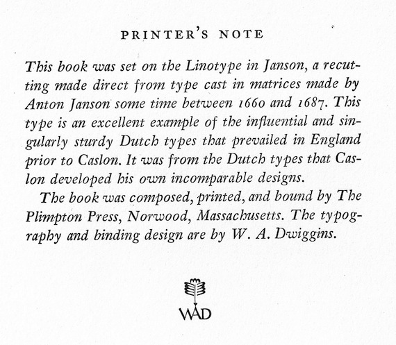
Dwiggins returns in my copy of Thomas Mann’s The Black Swan, a discard from the VA Hospital in Lebanon, Penn. His own trademark at the end is a nice touch.
18.
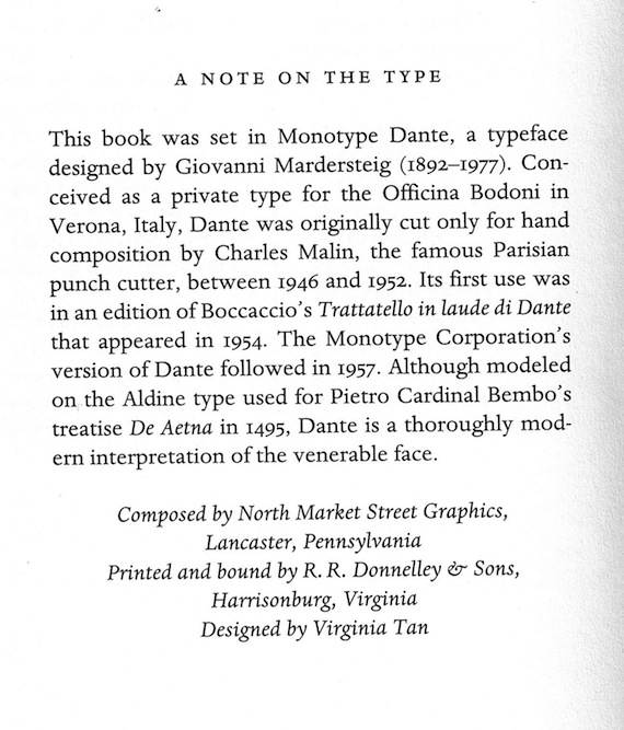
This colophon appears at the end of Crossing the Threshold of Hope. In 1993, Pope John Paul II had to cancel a planned live interview on Italian radio and television, but surprised the reporter by developing his responses into a full manuscript. Not every typeface earns the name of Dante.
19.
I call for the return of colophons. The battle of the book is not to be won or lost in preferences of print or digital. The page will always remain. Letters will always remain. Colophons can send us back into books for another level of reading. If we love books, that second reading might be ecstatic in the same way good writing can lift us. Colophons are reminders that books are bigger than their writers alone. They are the measured exhale at the end of a satisfying experience. The sentence has end punctuation; the book has a colophon.
20.
It is dangerous for a note on type to run too long, so even this appreciation must be truncated. The last words on type should go to a designer, so here is Carlson-Stanisic again:
Form and function is so important to us on every level — and people say that it is best when you don’t notice it — but I think design-oriented people will always stop to observe and appreciate it. There is something so sensual and so similar to the way we appreciate the curve of an arm on a well-designed chair, the elongated neck of a dancer, or the graceful curvature of a lower cased f set in Fournier italic. How could we survive without any of that beauty?