Sonya Chung is a freelance writer and creative writing teacher who nourishes her split personality by living part-time in the S. Bronx and part-time in rural PA. She writes and grows vegetables in both places. Her stories and essays have appeared in The Threepenny Review, BOMB Magazine, and Sonora Review, among others. Her first novel, Long for This World, is forthcoming from Scribner in March 2010. You can find her fiction and blog-chronicles (adventures in publishing a first novel) at sonyachung.com.
I.
If you’ve ever wondered what goes into designing a book jacket, you’re not alone. It was one of the things that seemed a bit mystical to me when my novel went into production. In fact, the process remained shrouded in mystery up until the moment I received an email from my editor with jpeg attachments of a few prospective designs.
Let me back up by saying that one of my favorite quotes is a line from indie actor/filmmaker Steve Buscemi, who said, in a profile in The New Yorker a few years back: “There’s something about being naïve. Really interesting things come because you don’t know what the rules are, what you can and can’t do.” I went into the publication process with little-to-no knowledge of what goes into producing, promoting, or releasing a book. And I had a vague sense that it might be fruitful to maintain some measure of that ignorance; that becoming immersed in the ins and outs of production and marketing could be detrimental, both to my writing process and to the publisher’s ability to do its job. How much of a sausage-making expert did I really want to become, and how useful to the publisher would my porky hands be?
II.
In the current publishing environment, this is a rather old-fashioned way of thinking, and unrealistic. Much more pro-activity is expected and required from authors, now that marketing budgets (for unknown writers, especially) are dwindling; and readers have come to expect and crave more personal connection with authors. As Farrar, Straus & Giroux Publisher Jonathan Galassi put it in his recent interview for Poets & Writers, “We’re selling authors, not books. We’re selling people the illusion of an experience with an author… They want the full experience.”
So it’s a somewhat complex relationship, an intricate dance. Contractually, the book no longer belongs to the author. And yet collaboration each step of the way is ideal. When it came to the book jacket, I was invited to be involved, and my input was both valued and incorporated; at the same time, I sensed that fussiness would be received as such, and knew that, technically speaking, the final decision was not mine. As a first-time novelist, new to the dance, I felt a little like I had two left feet.
III.
I did not have a specific picture in mind of what I wanted my book’s jacket to look like. But I did have a vague idea of what I didn’t want it to look like. I did not want the design to be too literal; I myself am drawn to jacket covers which are more evocative of a novel’s essence than descriptive of its plot or characters (I dislike, for instance, the movie-poster jackets of books which have been made into films, which often present celebrities’ faces for characters you’d rather imagine).
 I also knew that conveying the cultural elements of the novel in a jacket image could be tricky. In a recent article in Hyphen Magazine, books editor Neelanjana Banerjee expresses a frustration with the easy cultural tropes that are often used for the covers of novels by Asian Americans – fans, geishas (or other painted-faced women in traditional East Asian dress), dragons, chopsticks, lotus blossoms (I would add peonies, cranes, and scantily clad Asian temptresses) – to “mark” the books in an exoticized way and thus, presumably, sell more books to readers attracted to the familiarly exotic – whether or not those tropes best represent the novel’s actual thematic content or storyline.
So when I received the jpeg attachments, I was relieved to find that each of the drafts centered around a dream-like (non-literal) main image; which did not include any of the above-named objects or tropes (none of which are particularly relevant to the novel). The image was a rather spare photograph of a single, hatted (i.e. wearing a canvass sport hat commonly seen in the southern regions of South Korea), female figure, shot from the back, looking out into an illuminated horizon – somehow both figurative and abstract at once in its facelessness – that I thought evoked the emotional core of the novel quite well.
IV.
What’s strange about the jacket-design process is that the people who are weighing in are in a sense the least qualified to provide an informative gut-level response – a simulation of that half-second book-browser reaction. My agent, my editor, and I have all (obviously) read the book, so we came to the image as anything but blank slates. After considering my initial (positive) reaction, I registered a concern that the image was a tad too abstract, and that it would not be clear to someone who did not know the story what the figure was doing (she is taking a photograph).
So I forwarded the attachments to a couple of trusted friends, one of whom knew almost nothing about the story (about a Korean family, mainly an immigrant father and his American-born photojournalist daughter who find themselves reverse-migrating to the father’s village hometown in South Korea), the other of whom knew a little. I asked them, simply, “What do you see here?” The former wrote: “I see a white woman looking off into the distance, most likely taking a photograph.” The latter wrote: “I love it! But why is the woman white?”
Whaa?
This, you may have guessed, was not at all the response I was expecting.
V.
I mentioned these responses to my editor. She was shocked; it never occurred to her that the figure would be perceived as non-Asian, nor did it to me. As I looked more closely, brightening my screen settings, I saw that the woman’s hair had brownish highlights, accentuated by the light emanating from the horizon; it also had a slight wave to it. I thought, this must be what my friends are reacting to. So I asked my editor (trying not to trip over my two left feet) if she could track down the origins of the image, to see if it was a composite and might be altered. While she was (justifiably) dubious that the perceptions of two people warranted an alteration, she kindly agreed to do the research.
In the meantime, I sent the image to a dozen other people. I literally received six responses identifying the woman as Asian or “non-determinate race” and six responses identifying her as white (one person even used the word “WASPy”). I was stumped. What’s more, there was no discernible pattern in the responses, no correlation between response and respondent: people of Asian descent, people of non-Asian descent, people who knew the story or didn’t, male or female, political persuasions one way or another – the responses were all over the place. (One of the people who identified her as white was a Korean American woman who herself had brownish wavy hair.) By the twelfth response, I just had to laugh. Fascinating! This was turning into a kind of Rorschach test.
My editor wrote me back with the results of her research: no, it was not a composite and thus could not be altered. But, as it turned out, the model in the image is in fact Korean; and here, attached, is a photograph of her from the front. Did this help settle it for me?
Well, no. Not really.
VI.
What is the primary function of a book jacket? The adage “You can’t judge a book by its cover” is, to me, despite its cliche status, rather sophisticated in its irony; because in fact we know darn well that not only can you judge a book (and, to some limited degree, the metaphorical person to which the adage refers) by its cover; but that a good many book-buyers do judge books by their covers. I was encouraged to focus on the question, “Does it make someone want to pick up the book and find out what it’s about?” In the case of this design, I’d say sure, and most of the respondents would, too. Regardless of the racial identity of the figure, the emotional evocation is, I think, compelling overall.
But would the perceived race of the figure affect one way or another whether someone would pick it up? And what about after the half-second impression? Has the jacket cover fulfilled its purpose at that point? Would finding that the character is of a different race than initially perceived (and that the story is a bicultural story) affect the reading experience? And does the fact that the “truth” of the image matches the “truth” of the story – that the model is Korean – matter, if the reader does not have access to this background?
The questions spiraled out from there: how much does the author’s name affect the reader’s expectation of the novel’s content? Does the name “Chung” on the cover incline readers to certain assumptions? What does it mean that some segment of the population expects that an Asian woman would have straight black hair though not all of them do? Is it productive to work at meeting the expectation, or is the time ripe in our culture to test the waters of deviation and diversity? I could also hear in my head the voices of Ethnic Studies activists and feminist scholars challenging the tyranny of Western beauty standards and the blondifying of Eastern cultures.
What to do?
VII.
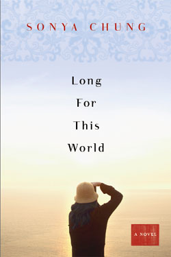 There is actually an end to this story, and a rather anti-climactic one. (No dramatic showdown between author and publisher, no grand moral stances taken.) As my editor and I discussed it further, we realized that her computer screen was showing black hair. So I asked her to send me hard-copy printouts of the image; and as it turned out, it was in fact variations of screen views that created different hair-color shades and thus impressions. The hard-copy showed black hair, and without the highlights, the appearance of the wave was slightly less pronounced. We liked the image all along, and we knew it would be hard to recapture all that we liked about it if we went back to the drawing board. We decided to go forth.
I am still a little nervous – having no control over the final printing process, color-correcting, etc. – about what this cover will look like. But I also realized that as each response piled on one after the other in my inbox, I was beginning to delight in the wackiness of the whole thing. Would Jane, the character in the novel, be so easily identified or defined by race? She is unambiguously an American of Korean descent; but she is also many other things: a war photographer, sister, daughter, lover, survivor of trauma and tragedy. She is a woman looking for her life in the wake of death. She would never deliberately deceive; but she would embrace the essential mystery of identity, the complexity of perception from the viewpoint of the beholder.
And – no surprise – so do I.
