If you are a popular and prolific enough author, an interesting thing happens to your books, they all begin to look the same. This is the primary outward manifestation of an author as a brand. As a large oeuvre gets rounded out to perhaps a dozen or two titles, the publisher picks a certain design and rereleases all the titles to have that design. This makes a lot of sense. If you are a fan of Prolific Author A and are working your way through his body of work, you’ll soon be on the lookout for the distinctive style his publisher has chosen for his paperbacks. The problem is that all too often, these uniform designs are ugly. My prescription, however, is to scale back on the shared elements and to try to present each book more uniquely so that it feels like as much effort has gone into packaging each individual book as went into to writing it.
From my days in the bookstore, I know how important, often subconsciously so, book cover design can be. With that in the mind, there are some very well-known authors whose uniformly designed books are doing them a disservice and deserve an overhaul:


The Vintage paperback editions of William Faulkner’s novels have it all: terrible fonts, jarring colors, and strange, bland art. The covers betray none of the complexity of Faulkner’s work and instead promise soft-focus confusion. They feel dated and badly in need of a refresh. Better versions: Check out the prior paperback covers of As I Lay Dying from Penguin and Vintage.


Maybe it’s the frames around the Ballantine John Irving paperback covers, but they remind me of hotel art. Irving’s masterful narratives have been reduced to representative but inanimate objects – a nurse’s uniform, a motorcycle – that occupy the safe middle ground that Irving’s books eschew. Better versions: There is a certain dignity to the text-only designs that once graced Irving’s covers.
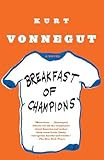
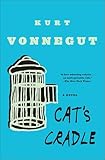
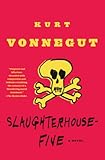
For a writer as inventive and unique as Kurt Vonnegut, it sure seems like a shame to just slap a big “V” on all his covers and call it a day. Better versions: They may not offer a uniform look, bit I prefer the energy of the old pocket paperback versions of Vonnegut’s novels.
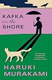
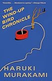
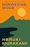
Far better are the Vintage Murakami paperbacks, which evoke some of the most jarring and surreal qualities of Murakami’s fiction. They also maintain a consistent aesthetic and yet they still vary from title to title. Even better versions: The Chip Kidd-designed British hardcover of Wind-Up Bird Chronicle captures the vivid imagery while hinting at the underlying complexity.


