1.
Before I saw the cover of my second novel, I worried about it. My greatest fear was this: A woman, looking out to sea. Her back is to the reader. Her hair is thrown up in a vague style that if nothing else can be described as “timeless.” Her stance evokes a wistful, feminine longing—for a man, perhaps, or for a dinner she doesn’t have to cook.
You know this cover. Hundreds of versions exist. There are covers that display only a woman’s head—from behind—and countless others that show a woman’s body, without the head. Sometimes, a complete woman is shown. My first novel got this treatment. Originally, it got no woman at all, just a beautiful, font-only cover. Then a “step-back” was added, one of those glossy pages that sticks out from behind the actual cover to catch the reader’s eye. The step-back showed a woman—from behind—standing in a field in a lilac-colored dress while looking off into some middle distance, and was presumably meant to assure readers that however muted (i.e. perhaps literary) the cover, the story did indeed include a woman who might, if called upon for marketing purposes, stand out on the prairie, not holding anything, not doing anything, just looking wistfully away.

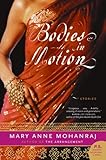 In the years between that first book and the second, these sorts of covers had begun to make my heart seize. Their ubiquity might almost be laughable, if it didn’t reflect and result in serious inequities. Walk into a bookstore and see which authors receive what Eugenia Williamson, in a wonderful essay on “the implied correlation between feminine imagery and literary inferiority,” aptly terms the “Sexy Back” or “Headless Woman.” I’ll save you the work: they’re rarely men. Even when male authors write novels that include women and sex—and let’s face it, how many novels don’t?—their covers are more likely to feature large font, maybe an abstract image, perhaps a landscape. In a survey of covers by South Asian writers, Mary Anne Mohanraj notes that the books by male authors displayed “ancient paintings, people in motion, buildings or cities, large landscape features, such as bridges or mountains, abstract images, the author’s name or title, and the color blue.” Mohanraj’s own collection of stories, Bodies in Motion, was first given a cover showing the open pages of a book, but this was nixed by her marketing teams and replaced by a woman—headless, of course—in a red sari. While her critique addresses the gendering of South Asian literature in particular, the trend is global. Cristina Henríquez’s second novel, The Book of Unknown Americans, went through a similar twist: an initial cover by acclaimed designer Chip Kidd that featured a semi-abstract, red-and-blue couple in embrace was rejected in favor of a girl’s head against an aqua backdrop, viewed—yep—from behind.
The messaging is clear. These covers are code for “women’s fiction”—i.e. breezy, easy, accessible. For many women authors who don’t happen to write breezy fiction, we feel caught in a double bind, with a cover that demeans the book in the eyes of the literary establishment while also promising readers a kind of book we didn’t necessarily write. When the book doesn’t sell in a huge way—and most don’t—we’re left feeling like we lost on both fronts.
2.
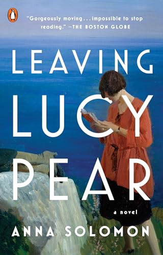
The night I finally got an email with the subject line “Cover!” I was out for a drink with a friend. I glanced at the downloading image for only a second before passing my phone like a hot potato to my friend. I felt ready to fight this time, for my second novel—no woman on my cover! I winced, waiting, until my friend said, “Oh!” and showed me. I loved it right away: the bold colors, the big letters, the feeling I had looking at it that I was on the verge of something. And then I saw what I was looking at: a painting of a woman, standing on a rock by the sea. She was not facing away. She was not doing nothing. (She was reading a book.) She was neither headless nor bodiless. But she was a woman. And she was on my cover.
I was miffed, because it was what I’d known would happen, and because I loved it.
3.
A couple days later, I was looking at the cover again when I noticed something strange on the rocks next to the woman. What were they? I nosed closer. A pair of boots. Someone was lying on the rock—another woman, judging by the boots. So there was not just one woman on the cover of my book but two! And yet, despite myself, I loved it even more, because the boots made the second woman a mystery. They opened up the cover for me. They seemed to be the feet of all the characters I had created, all of them at once, lying on a rock together, listening to this other woman reading their stories to them.
4.
A while after that, my editor sent me another email: “Thought you’d like to see this.” She linked to the larger painting from which the cover had been drawn. The boots turned out to be attached to a woman in a black dress, who is looking out—though not at the viewer—with what I can only describe as a delightfully illegible expression. She might be half-asleep. She might be judging the woman reading to her. She might have to pee. She might—my favorite interpretation—be aware of the viewer and proudly ignoring us.
“Will it wrap around the book?” I asked. Because I wanted this woman, too.
5.
Once I saw the whole painting, called “Summertime Cornwall”, I wanted to know about the painter. I looked her up and learned that Laura Knight, a British artist born in 1877, managed to be both wildly popular and a pioneer: in 1936, she was the first woman elected to the Royal Academy; decades later, she was the first woman to whom the Academy gave a large retrospective. Most striking to me was the controversy Knight stirred in 1913 when she made a painting called “Self Portrait with Nude”. At the time, women artists were restricted to using casts of the human body, not live models. So when Knight’s painting was shown, depicting herself in her studio painting a sensually positioned model—her back to Knight (and us), her arms lifted to cradle her head, her hip tilted, the pale curve of one breast visible—the art world was shaken. The Royal Academy rejected the painting. The Daily Telegraph called it “vulgar.” Others embraced her challenge to the establishment. She became a sensation.
The more I look at Self Portrait with Nude, the less I focus on the model. I notice Knight herself. She is dressed in plain work clothes, another affront to custom, for women painters typically painted themselves as conventional subjects, dressed in finery. I am reminded of Marilynne Robinson talking about how she likes to write on her couch in clothes that “disappear,” how her body drops away and leaves her mind freer. Looking in this light at Knight, in her frumpy jacket and loose skirt, I see that she is asserting her right—at least for a period of time, in her own studio—to not be looked at, but to look.
6.

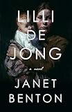
 My publisher kept the cover for the paperback version. Laura Knight’s two women are still there, one reading her book, the other looking out with her unknowable gaze. I still love them, though I can’t explain exactly why. And I keep seeing other wonderful book covers with women on them. On the cover of Claire Dederer’s new memoir, Love and Trouble, a young Dederer stares out at us as if to say, What are you staring at? A similarly assertive woman, holding a baby, faces us on Janet Benton’s debut novel, Lilli de Jong. There is even a woman—albeit a very tiny, blurry one, largely overwhelmed by large blue font—on Jonathan Franzen’s last novel, Purity.
Maybe the point isn’t banishing the women from the covers. And maybe it’s not even that the women should be more active and less sexualized—though there are still plenty of covers that shamelessly traffic in women’s backs and belittle authors and their work. The bigger problem may be how the women on book covers are received, and not only by top review outlets that routinely cover men’s books in egregious disproportion to those by women—check out the Vida Count if you’re unfamiliar with this issue—but by women ourselves. We’ve internalized the establishment’s dismissal to the point where we can write a book about women, and maybe about children, too, and sex, and then feel pissed off when women and children and sex show up on our covers.
What if we were to reclaim them, as Important Subjects? We know that they are. And we know that they are tied up inextricably in the subjects deemed important by the patriarchy: war and death and politics and business. We have written all this into our books, in fact, though perhaps with different emphasis, or in different form. My novel, for one, concerns itself with World War One, Nicola Sacco and Bartolomeo Vanzetti, Prohibition…and men! Straight men, gay men, men being dicks, men getting their hearts broken. Still, it’s fair to say that the most central characters are women. Why should I be ashamed of that? I’m a woman, too. If a man doesn’t want to read my book because there’s a woman on it—and my publisher hasn’t given it what Williamson calls the “man trap” treatment (really, you should read her essay)—so be it.
The painter Laura Knight was engaged in a project that sounds, like so many difficult projects do, very simple: asserting that women and our lives are of equal value to men and their lives. It sounds so simple that it’s easy for me to forget sometimes that the very fact of my working is an assertion. Last week I met a woman who had written a book arguing that women should make their children their top priority until the age of three, and blaming a plethora of childhood disorders on less-than-present mothers.
Hearing this was enough to drive me home to my kitchen table, where I sit now, writing, and where I’ll stay, writing, until I have to make dinner for my kids. Or, maybe, I’ll stay at this table until the instant I have to pick them up, and not cook at all. Mac and cheese has yet to kill anyone. But work—good work—has the power to keep us fully alive. That’s why I’m wearing worn out clothes, like Laura Knight in her self-portrait. There is always time to be seen. For now, I sit, in my version of a studio. This is what I see.
Previously: “A Funny Thing Happened on the Way to Designing a Book Jacket…”
