As we’ve done for several years now, we thought it might be fun to compare the U.S. and U.K. book cover designs of this year’s Morning News Tournament of Books contenders. Book cover art is an interesting element of the literary world — sometimes fixated upon, sometimes ignored — but, as readers, we are undoubtedly swayed by the little billboard that is the cover of every book we read. And, while some of us no longer do all of our reading on physical books with physical covers, those same cover images now beckon us from their grids in the various online bookstores. From my days as a bookseller, when import titles would sometimes find their way into our store, I’ve always found it especially interesting that the U.K. and U.S. covers often differ from one another. This would seem to suggest that certain layouts and imagery will better appeal to readers on one side of the Atlantic rather than the other. These differences are especially striking when we look at the covers side by side.
The American covers are on the left, and the UK are on the right. Your equally inexpert analysis is encouraged in the comments.
 |
 |
| So this is interesting. It would seem that us American readers require more orbs to get us interested in a novel of Victorian scope and heft. I like the slightly more subtle U.K. look | |
 |
 |
| The U.S. version is a little dull though it has a pleasing spareness to it and I like the vintage botanical illustration thing going on there. I far prefer it to the U.K. cover. I get that there’s a handmade motif happening but the colors are jarring to my eye. | |
 |
 |
| I don’t think you would ever see a cover that looks so “genre” on a literary novel in the U.S., and it kind of makes sense with Hamid’s self-help-inflected title and the “Filthy Rich” in a giant font. The U.S. cover is aggressively boring. | |
 |
 |
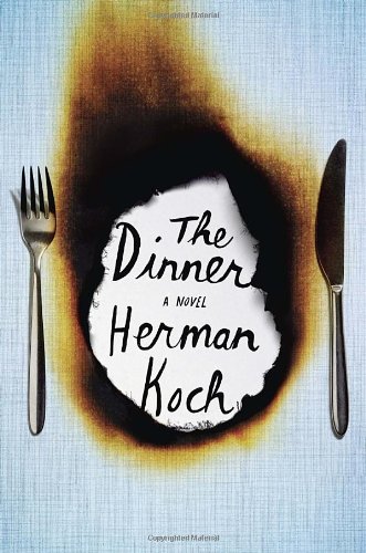
| Both are bold, but I prefer the U.S. cover. The burnt tablecloth is a more original image than the lobster. | |
 |
 |
| I suspect I may be in the minority here, but I prefer the U.S. cover which seems to bank on the Lahiri name, rather than the U.K., edition which seems to telegraph the subcontinental content. | |
 |
 |
| Neither of these seems to be exerting much effort to break out of the Western-genre tradition, but the U.S. version’s painterly affect at least gives it a little intrigue. | |
 |
 |
| At first glance, both of these appear to be going for the creative use of classic Asian motifs, but the British cover is actually pretty wild, using something called “Blippar technology” to produce an animated effect when you look at it with a smartphone. So, points for innovation in book cover design. | |
 |
 |
| Both of these are pretty great, but I love the U.S. cover. It’s clever to have a YA book with a cover that looks drawn by the hand of a precocious teen. It kind of reminds me of the similar design philosophy of the 2007 movie Juno. | |
 |
 |
| Drawings inspired by vintage botany texts must be in this year. Here we have two different versions of the same idea, but the U.S. take is more lush and interesting. | |
 |
 |
| Atkinson is a superstar in the U.K. (as opposed to merely having legions of devoted fans in the U.S.) so that may account for the foregrounding of her name on the U.K. cover. Regardless, the U.S. look is far more intriguing. | |
 |
 |
| The Flamethrowers unaccountably didn’t get a Tournament bid, but it should have, so we’ll include it here, especially because it’s a great example of some seriously bold cover design going on on both sides of the pond. | |
