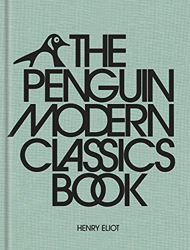
At The Guardian, Killian Fox takes a closer look at Henry Eliot’s The Penguin Modern Classics Book, which contains everything you need to know about the most acclaimed literature of the past century, the era-defining Penguin series, and the stories behind their book jackets. “Eliot’s new book opens with a section on how the cover design has evolved, and you can see the carefully considered but striking changes that were introduced by successive art directors over the decades,” Fox writes. “Dominant colours (orange, dove grey, eau-de-nil) drop out, only to creep back into later iterations. Typefaces get axed, after much agonising, to be replaced by more modern-looking counterparts. Grid layouts are imposed – many 1960s covers were designed according to the so-called Marber grid, which sectioned off the publisher’s logo, the title, the author’s name and the image—only to drift after a few years or get overhauled completely.”
The Story Behind Penguin Modern Classics’ Iconic Cover Designs