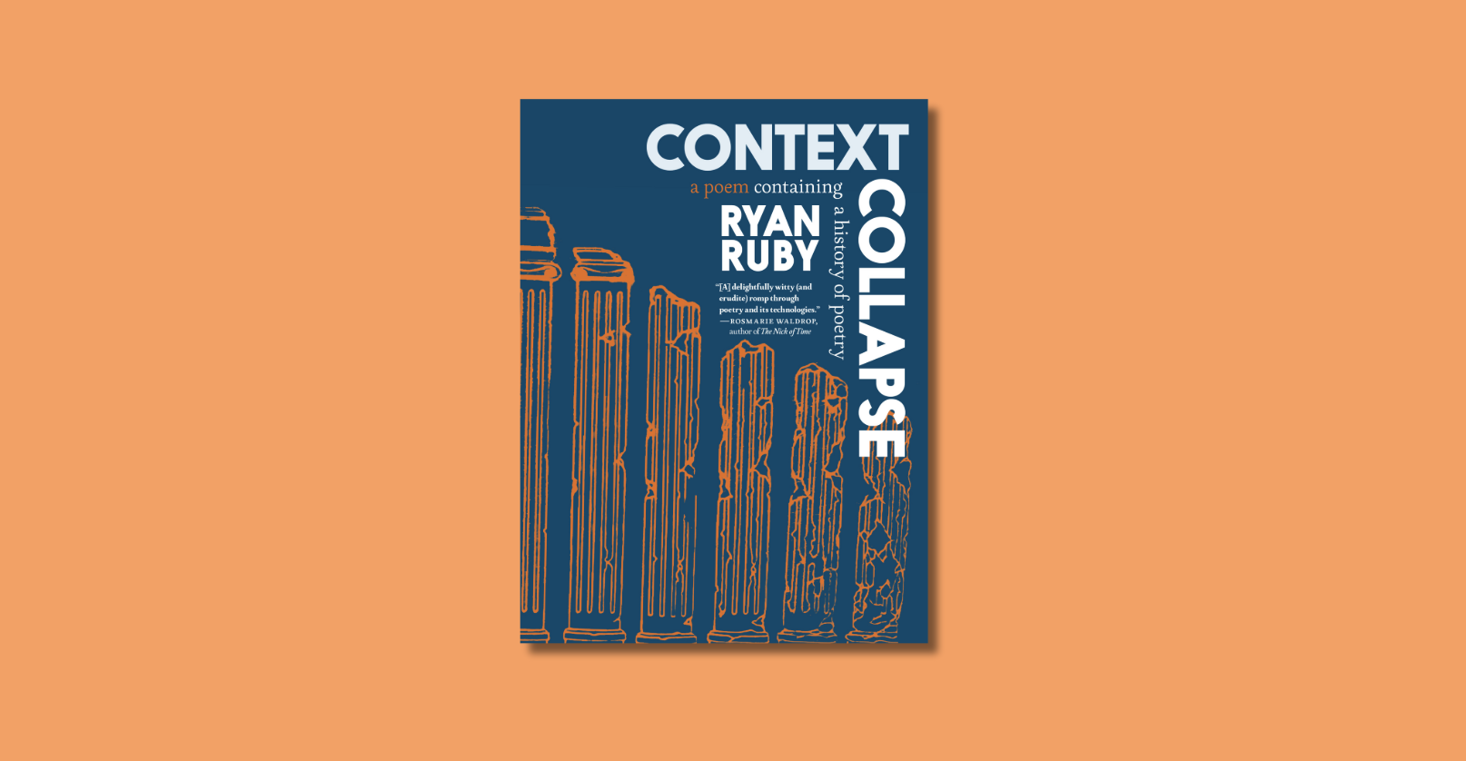
Holy Crap! Have you been into a bookstore lately; have you noticed how good books look these days? When I go to used book stores, I find that all the books released during a particular decade tend to look like one another with not much variation. But now you walk into a book store and each new book looks like a work of art. Some remarkably attractive books have come out over the last few years, and book design has come into its own as an art form that it is peculiar adventurous considering the publishing industry’s ever tightening ties to multi-national conglomerates. A lot of this is marketing. Many of the companies that own the publishing houses also have major entertainment divisions, and they tend to use the same marketing style to push both their movies and their books. Hence, book covers have gone the way of movie posters and trailers; they seek to grab the attention of the reader with an alluring display of eye candy. Every day, I see people buy books simply because of how cool the cover looks. You would be surprised at how often it happens. Which brings me to another reason why book covers have become more adventurous: people are ready for it… they need it even. People are constantly bombarded by interesting and strange visual imagery on television, in movie theaters, on billboards. If every book looked the same, people wouldn’t buy as many books, no matter how amazing the contents. It’s kind of sad, but not entirely. Though a result of the pervasive marketing that seems to have taken over our culture, the good looks of these book covers are still a good thing. Where else do graphic designers get such freedom in such a corporate setting? Where else is art combined in such an interesting way with the written word? If you want it to be, you can now treat every visit to a book store like a trip to an art gallery. Walk slowly down the aisles and admire the artwork, take the books in your hands and inspect the detail as closely as you want, then buy whatever it was you came in for. You’ve just turned an everyday act of commerce into an experience in art appreciation.
Which brings me to Chip Kidd. If there is any one person who is at the forefront of forward looking book design, it is Kidd. As a book designer for Knopf, he has designed literaly hundreds of covers, and, as a result, has been heralded as the best in the business. To celebrate his work Yale University and Veronique Vienne have come together to produce a very attractive volume collecting and celebrating some of Kidd’s many covers. It is entitled, appropriately, Chip Kidd. Here are a few of Chip Kidd’s book covers:


