“Trouble” (1989) by Christopher Wool, courtesy of the Guggenheim Museum.
1.
We tend to think of words as the exclusive raw material of writers. But this has been a season of sparkling reminders that artists from many camps — cubism, conceptualism, minimalism, realism and pop — have used words to fashion some of the most inspired art of the past century.
The most loudly trumpeted of these reminders is the Christopher Wool retrospective now at the Guggenheim Museum in New York. In the very first room at the bottom of the rotunda, you run smack into Wool’s mission statement. Stenciled letters are stacked top to bottom on a sheet of white aluminum. As you gaze at the jumble, devoid of spaces or punctuation, words begin to emerge, then sentences, and finally a message. It reads, “The show is over. The audience get up to leave their seats. Time to collect their coats and go home. They turn around. No more coats and no more home.”
The show’s over? But it just began! Welcome to Wool’s world, a place that offers doubt instead of certainty, a world full of disappointment and misfits and unease. A note on the wall beside “The Show Is Over” tells us that the words are from a 1918 essay by the philosopher Vasily Rozanov, allegorizing the upheaval of the Russian Revolution. The Situationist writer Raoul Vaneigem later promoted their sentiment as the ideal description of nihilism. This layering of meanings is reflected in the painting itself, a palimpsest, with painted-over letters visible behind the foreground letters. Something you don’t appreciate from a reproduction is just how painterly the picture is, how rigorously the surface is worked, how the hard edges of the letters actually wobble and the white background paint sometimes bleeds onto them. It’s ravishing, visually and intellectually, a deft dovetailing of medium and message.
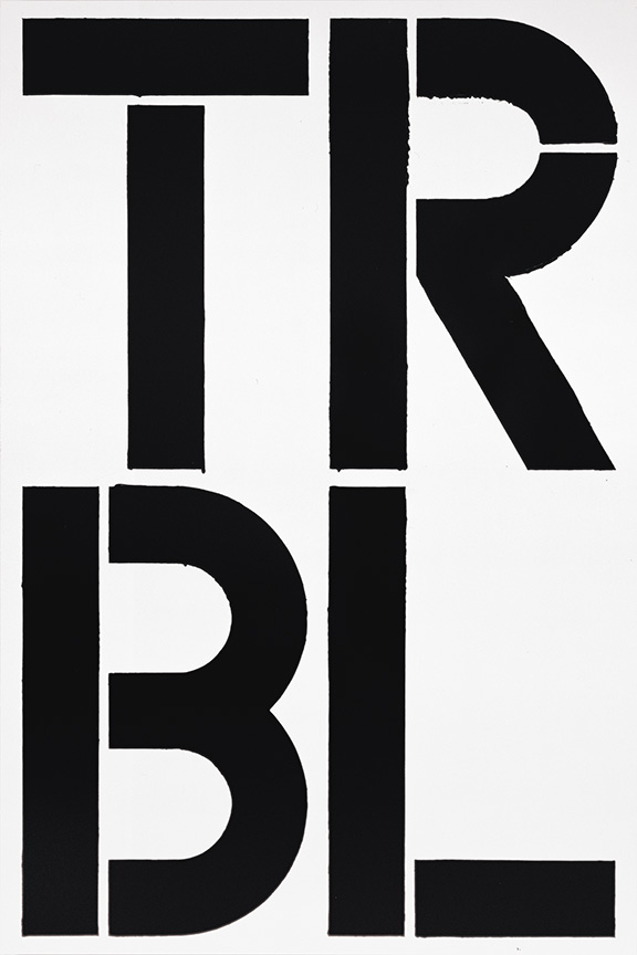
Wool started making word paintings in the 1980s, his response to talk that painting had run its course and reached a dead end (just as people periodically pronounce the novel dead). Some of his word paintings are verbose, others are terse. A typically disconcerting bit of shorthand is called “Trouble,” just the word’s four consonants stacked two on top of two. Another four-letter work is “Blue Fool,” the indigo F and O atop the O and L. It feels like Wool is sneering at people who come to museums, but a note assures us that the painting is a “melancholy self-portrait.” It’s a small consolation; the unease has already set in. A series of nine-letter words, arranged in three triple-letter stacks, list the unsavory characters who populate Wool’s world: insomniac, chameleon, anarchist, terrorist, paranoiac, informant, psychotic, celebrity. (The show also includes non-verbal paintings and many grainy photocopies of grim street scenes photographed at night.)

“Untitled” (2000) by Christopher Wool, courtesy of the Guggenheim Museum.
Finally, at the top of the rotunda, is the painting that ties it all together. It reads, THE HARDER YOU LOOK THE HARDER YOU LOOK. It makes plain that Wool refuses to offer tidy satisfactions. Or does he? Again you see the ghosts of painted-over letters behind the foreground words, and you learn that originally the painting read THE HARDER YOU LOOK THE HARDER IT LOOKS BACK. The sentiment is from the Austrian writer Karl Kraus, who wrote, “The closer you look at a word, the greater the distance from which it looks back.” Wool apparently agreed with Kraus, then changed his mind and chose to disagree. Rarely have doubt and disagreeableness been so lovely and so rewarding.
In “Come Together: Surviving Sandy,” a sprawling group show at Industry City in Brooklyn, Deborah Kass exhibited a neon word sculpture called “After Louise Bourgeois.” It consists of a vortex of shrinking letters that seem to swirl down a drain as they explain what the fearless Bourgeois means to Kass and many other artists: “A WOMAN HAS NO PLACE IN THE ART WORLD UNLESS SHE PROVES OVER AND OVER AGAIN SHE WON’T BE ELIMINATED.”
Liam Gillick
Detail, Övningskörning (Driving Practice Parts 1 – 30), 2004
Powder-coated aluminium
30 elements, each approximately 96 x 12 x .5” / 243.8 x 30.5 x 1.3cm
Photo: Jean Vong
Courtesy the artist and Casey Kaplan, New York.
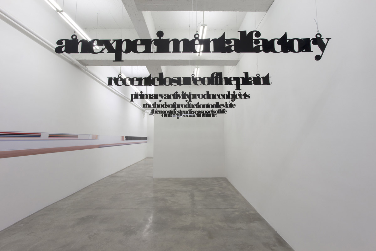
While Kass’s message is revealed through the downward spiral of her words, the sculptor Liam Gillick goes in the opposite direction: his words take flight. In a show at the Casey Kaplan gallery in Chelsea, Gillick cut words from aluminum, painted them black, and suspended them from the ceiling. The narrative unspools as you follow these floating sentence fragments deeper into the white-walled gallery, and you realize you’re reading the story of autoworkers cut adrift when a Volvo factory in Sweden, founded on immaculate socialist principles, gets sold and shut down. Here’s a piece of the complete text:
the methods of production were intended to alleviate
what had been identified as the most destructive aspects of life
on the traditional production line
the subsequent take-over of the company and closure
leaves nearly all of the former employees out of work
especially the older ones
it was a relatively progressive company
they have generous severance payments
and some time to consider what to do next
as their money runs out they get increasingly anxious
and increasingly alienated from the dynamic of the society
This is a story about the human cost of capitalism’s brute efficiency. As someone who grew up in Detroit and watched the relentless shuttering of auto plants send the city into its current state of financial and physical ruin, I think I can say that Gillick’s message is an important one for our times. It’s also quietly beautiful. And quiet beauty is hard to come by nowadays in Chelsea’s big-box, high-dollar galleries.

Scott Reeder
Untitled (Pasta Painting) (detail)
2013
Oil and enamel on canvas
96 x 108 inches
Courtesy of the artist; Kavi Gupta, Berlin & Chicago; The Green Gallery, Milwaukee; Lisa Cooley, New York
Even quieter is a series of word paintings by Scott Reeder at the Lisa Cooley gallery on the Lower East Side. Ranked along one wall, his bright paintings pair two four-letter words, one atop the other, to give us this Detroit-based artist’s view of a world full of fakery, menace, and light fun. (He uses pasta to make his pictures.) Some samples: FAKE RICH, IFFY IDOL, MOOT MEME, JUST INFO, COPS KISS. On the gallery’s back wall is a large painting (96 by 108 inches) that appears to be a starry sky at night. As you step closer, though, you realize the stars are actually tiny white letters and numerals. It’s a bewitching expression of the infinite possibilities of language.
The use of words in art is nothing new, of course. A century ago cubists such as Picasso and Braque inserted snippets of newspaper advertisements into their fragmented compositions. Magritte combined images and words in his famous 1928 painting of a pipe with the message This is not a pipe. More recently, Barbara Kruger followed his lead in works that combine photographs with wry verbal messages, such as her picture of a hand pressing the point of a safety pin to a fingertip on another person’s hand, overlaid by the words Thinking of You. Jenny Holzer, Bruce Nauman, Lawrence Weiner, John Baldessari, Jasper Johns, and many other artists have used words, even whole alphabets, in their work. Ed Ruscha has made paintings out of isolated monosyllabic words, including “Oof,” “Honk,” “Boss,” “Noise,” and “Smash,” as well as the Hollywood sign and corporate logos. Ruscha once said, “I like the idea of a word becoming a picture, almost leaving its body, then coming back and becoming a word again.” With Ruscha’s one-word paintings, there’s no need to look harder. One look says it all, which is part of the visceral fun.
2.
What these very different artists have in common, I think, is a hunger for that most writerly of staples, narrative. Curiously, it was not a word artist who made me aware of this hunger. It was the rigorous realist Rackstraw Downes, a 74-year old Englishman, recipient of a MacArthur “genius” grant, a painter of meticulous rural landscapes and urban scenes that spring from an enormous ambition. Downes has spent his long career trying not merely to capture the world as we see it, but the world as it is. He has said,” I want to paint exactly the way something is” — as opposed to the edited version after our brain has processed what comes through our eyes. And so his horizons slope, his bridges curve, his power lines wiggle, his skyscrapers tilt. He eschews conventional subject matter in favor of more prosaic, but narratively more potent, subjects, including lumber yards, oil fields, housing projects, scrap heaps, the underbellies of bridges. He paints onsite, without the aid of photographs, working for months to render a scene exactly the way it is. The paintings are visually stunning and they accomplish in one stroke what all realists strive for: They make us feel that we are truly seeing the world for the first time by elevating, in Downes’s formulation, “the art of being intensely, thoroughly observant.”
 I began to become aware of the depth Downes’s artistry — and its reliance on narrative — after seeing a retrospective of his work and then reading his rewarding little book of essays, In Relation to the Whole. (Downes studied literary criticism before taking up painting, and he is as insightful on the writing of Stendhal, Chekhov, and Maupassant as he is on the art of Brueghel, Charles Burchfield, and Manet.) Two artists whose use of narrative strongly influenced Downes are Breughel, who x-rayed man’s monumental hubris in his tiny painting “Tower of Babel,” and Burchfield, a painter of ecstatic natural worlds. Burchfield, Downes wrote, “combined the vision of the romantic poet with that of the naturalist. It is a vision that reads nature, for whom a wildflower is not a spot of color but a sign, revealing nature’s processes…Following Burchfield, I tried to see the landscape as including legible stories as well as combinations of forms or qualities of light.”
I asked Downs about the importance of storytelling in his work. “It’s very important to me,” he said, “and I think it is to everybody’s landscape painting. I think it’s a shame to think of landscape painting as some sort of abstractness. It’s not. It often does tell a story. I seek out those stories I’m intrigued by.”
One such story is told in a spectacular 1990 painting called “In the High Oil Field, February, After the Passage of a Cold Front.” (Like another of his heroes, John Constable, Downes is obsessed with making his pictures meteorogically accurate, and his wordy titles often include a picture’s exact location, point of view, time of day, weather conditions, and other pertinent data. For comparison, see Constable’s “Hadleigh Castle, Mouth of the Thames — Morning After a Stormy Night.”) “High Island Oil Field” is 10 feet long and just 16 inches tall, a favored Downes format, and at first glance it’s a humdrum scene — a vast platter of Texas scrub punctuated by some wheezing oil rigs, a trench of reddish water, a distant, slope-shouldered horizon under an empty blue sky. But, with apologies to Christopher Wool and Karl Kraus, the harder you look the harder it looks back and the more you see. Downes, a descendant of Breughel, is ever alert to the ways man’s hubris alters the natural world. Here is his description of the picture’s narrative:
It represented for me an accommodation, a sort of peaceable kingdom. The pumps are on raised platforms because this land, which is at sea level, floods during a hurricane. Cows, horses and wading birds share this 1,200-acre field with the pumps, and when strong winds blow in from the north after the passage of a cold front, the sediments that are pumped up with the oil and natural gas and which collect in the bottoms of ditches, are stirred up so the ditch water looks red. The perspective down the center of this painting is the raised embankment of an old railroad bed. The cows like to congregate and lie down to rest on this long-infertile ground because it dries off quickly after a rain; and so they dung it up intensively too. So, it is gradually beginning to regain fertility and support a sparse cover of weeds which spread in by runners from either side of the embankment. Here the tenses of a landscape imagery which represents what is lost or threatened are reversed: we see decaying industrialization being replaced or reclaimed by the progress of nature. Those weeds interest me more than ancient redwoods; they are the vanguard of nature’s forces as she wages her war back on us; perhaps I should say, here nature re-embraces us, her prodigal sons and daughters. These weeds give the idea of nature not as a state we’ve lost but as a process with a future.
In Downes’s skilled hands, a scruffy Texas oil field reveals a narrative equal to Breughel’s “Tower of Babel,” which Downes sees as “a symbol of hubris, of man too big for his boots.”
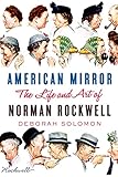 Another artist who told stories with paint was Norman Rockwell. Once dismissed as a purveyor of kitschy Americana, a lowly illustrator, Rockwell’s reputation as a major artist is now surging. There’s a retrospective of his career at the Frist Center for Visual Arts in Nashville. Rockwell’s famous painting, “Saying Grace,” just fetched a staggering $46 million at auction. (He was paid $3,500 for it in 1951 by The Saturday Evening Post.) And he’s the subject of an insightful new 500-page biography by Deborah Solomon, American Mirror: The Life and Art of Norman Rockwell. The book reminds us that Rockwell’s diverse fan base has included Willem de Kooning, Andy Warhol, and Steven Spielberg, and it makes the case that Rockwell, like Downes and the makers of word art, was driven by a need to tell stories. Here’s how Solomon describes Rockwell’s method:
Proust had his madeleine and Rockwell had his lamppost. He saw it clearly before him, a lamppost on a quiet street. Then he imagined what could happen to it. A boy climbs up it, a boy falls off it; someone chases the boy around it. He did this all the time, envisioning the lamppost and waiting for the scene to emerge, a boy or two, a certain facial expression, a story.
Pieter Breughel’s “Peasant Dance” hung over Rockell’s mantel. “The story,” Rockwell said, “is the first thing and the last thing.”
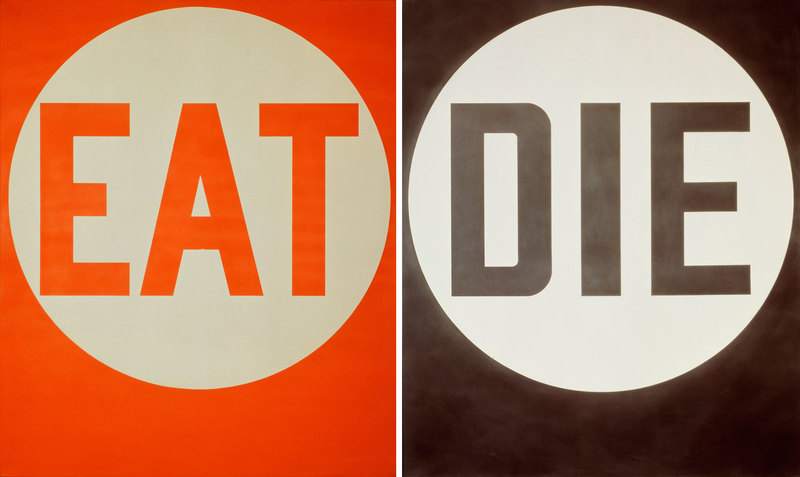
Robert Indiana (b. 1928), EAT/DIE, 1962. Oil on canvas, 2 panels, 72 × 60 in. (182.9 × 152.4 cm) each. Private Collection. ©2013 Morgan Art Foundation/Artists Rights Society (ARS), New York
3.
The wordiest of all the current shows is “Robert Indiana: Beyond LOVE,” now at the Whitney Museum of American Art. This career retrospective, as its title implies, sets out to make the case that Indiana’s body of work is richer and far more diverse than his best known and most iconic image, the two- and three-dimensional renderings of the word LOVE, with its L and skewed O stacked on top of its V and E, all the letters tightly interlocked, multi-hued, ever-changing, simple and yet endlessly complex, which is to say Indiana has made the physical word into something much like the emotion itself.
The show is a knockout. We see Indiana grappling with that woolly beast, The American Dream, restlessly probing its promise, glitter and horror. The result is a coast-to-coast gabfest, a cacophony of words, including the names of “American Sweethearts” (May, Lil, Ida, Flo, Ivy, Eva), place names (Chicago, Indiana, the deep South), signage (“Bar,” “South Ferry,” “The American Gas Works”) and political slogans (“Just as in the anatomy of man every nation must have its hind part”). It’s easy to believe Indiana’s claim that he was influenced by the writings of Melville, Walt Whitman, and William Carlos Williams. I’m guessing he’s a Kerouac man too.
For me, the most intriguing piece in the show is “EAT/DIE,” specifically the iteration of those words in large block letters on discs inside two squares, EAT in sunny orange, DIE funereal black. One critic likened this pair of words to “signs for a greasy-spoon diner in an existential film noir.” But I think that reading is reductive and beside the point. For me, “EAT/DIE” is nothing less than shorthand for the futility and pointlessness of human striving. We spend years eating (and making art and writing essays and building skyscrapers) and then we die. And that, as they say, is that. It doesn’t mean anything and you can sum it up in two three-letter words. Indiana’s act of compression is every bit as powerful and unsettling as Wool’s “TRBL.”
But of course it’s your call. You may read “EAT/DIE” as something altogether different, neither as signs for an existential greasy spoon nor as clever shorthand for the futility and absence of meaning in human life. That’s the maddening magic of words, and that’s why artists continue to be drawn to them: words are slippery, they refuse to be fixed, they tell stories that are open to infinite readings. And so they will always keep us coming back to art and to literature for more.