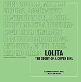
 I interviewed graphic designer/creative director John Gall for the upcoming book that I co-edited with Yuri Leving entitled Lolita – The Story of a Cover Girl: Vladimir Nabokov’s Novel in Art and Design being published this month by Print Books. In it, eighty graphic designers provided their own cover designs for Nabokov’s famous novel; and design luminaries, scholars, and the Nabokov-obsessed contributed essays discussing the difficulties inherent in representing visually the themes of this great and controversial novel. To top it off, Mary Gaitskill has written a very wonderful preface.
John Gall is the creative director for Abrams Books and previously spent fifteen years as art director for Vintage and Anchor books, where he was responsible for at least two Lolita covers, not to mention the redesign of the entire Nabokov catalog (minus Lolita).
John Bertram: Nabokov wrote: “I want pure colors, melting clouds, accurately drawn details, a sunburst above a receding road with the light reflected in furrows and ruts, after rain. And no girls.” And: “Who would be capable of creating a romantic, delicately drawn, non-Freudian and non-juvenile, picture for LOLITA (a dissolving remoteness, a soft American landscape, a nostalgic highway—that sort of thing)? There is one subject which I am emphatically opposed to: any kind of representation of a little girl.” What weight do you give this and his other well-known opinions about what should or should not appear on the cover of Lolita?
John Gall: I completely agree with Nabokov on what I think is his main point: No little girls. On the other hand, his description of what he would like reads beautifully but would be a complete yawner as a cover. It is so non-specific that it could be the cover of almost any novel ever written. A question I like to ask myself when designing a cover is: “Can this be the cover for any other book?” The closer you get to a “yes,” the worse off you are.
There are two directions for this cover: either you take the title head on and go with some representation of Lolita, or you don’t. But be careful; the land of metaphor is filled with furrows and ruts and roads going off into the distance.
All that being said, I love the concept of “pure colors” as an approach. “Melting clouds” . . . ?
JB: Dieter Zimmer concludes “Dolly as Cover Girl” with: “Which cover do you consider the best? . . . It is exactly this loaded question that each publisher must ask him- or herself when attempting to decide which of the artist’s sketches will appear on the front of a book. For such decisions there exists no theoretical apparatus, only the intuition of the individual responsible for making the final decision.” What, no theoretical apparatus?
JG: No marketing research either! Ah, the intuitive decision. This is what makes designing covers both wonderfully rewarding and incredibly exasperating. The research and theory and conceptual rigor are the responsibility of the designer. They need to bring that to the table. No one else will. No one is going to ask for more intellect on a cover, especially in the commercial book-publishing world.
When designing, I employ both the conceptual and the intuitive. Cover art is for the brain and the eyes. I’ve seen too many visually stilted covers that apply their concept too strenuously, leaving us with a flat, boring design.
JB: Peter Mendelsund eloquently writes in “Fictions”: “in attempting to sell a book, designers must, not always, but sometimes, pander to…a public which can on occasion lack the interpretive subtlety to parse literary subtext — i.e., if the general reading public expects a schoolgirl or schoolgirl uniform on a Lolita jacket, then book buyers and booksellers will also be expecting a schoolgirl or schoolgirl uniform on a Lolita jacket; and one can then reasonably assume that marketing departments in publishing houses will want them as well. In the end, going backward, upriver towards its source, even editors begin to take their cues from misinformed readers at large.” That certainly covers a multitude of sins. What do you think?
JG: Peter is spot on about this, though it is a fine line between pandering and communicating. I am trying to connect to as many people as possible with a cover. How do you do that without dumbing things down? I can’t tell you how many times I’ve had covers shot down because they are too “smart” or too clever, or worse “I don’t get it.” It can be seen as a liability. You won’t reach the people who don’t want to think for more than a second about what they are looking at.
I think a more interesting question might be: Why do people expect a schoolgirl or schoolgirl uniform or a girl in sunglasses with a lollipop? Is it all Kubrick’s fault? It wasn’t always marketing departments and editors forcing this issue. This stuff originated at the source.
Lolita is not only a book but also a cultural touchstone, and it carries a lot of baggage. There is so much visual reference associated with this book. There have been hundreds of covers. These schoolgirl uniforms and lollipops are all part of the visual language attached to the book. This has to be dealt with in some way. The visuals associated with the book are probably better known than the book itself.
For my very first attempt at designing the cover for Lolita, I attempted a typographic solution. After this was shot down, I made the decision to see if there was a way to reinterpret the iconography.
JB: Duncan White notes that “Lolita has been repeatedly ‘misread’ on the cover of Lolita and frequently in a way to make her seem a more palatable subject of sexual desire.” I’ve spent a lot of time looking at the cover you designed within this context and the more time I spend with this partial topography of a young girl’s face the more it becomes enigmatic, dissolving into a tabula rasa. Is it a stretch to suggest that your intention was provide an image upon which the viewer projects his or her own ideas about Lolita?
JG: This cover came about after a previous, more pointed design was rejected. I decided to see if I could put a twist on a classic image associated with Lolita: the lips. The lips we see on the final printed cover were originally positioned on the page vertically, giving the image a dual meaning — mouth or genitalia? It was cover as Rorschach, though a heavily weighted Rorschach. The responses to the cover ranged from revulsion to the publisher asking to have a printout framed for his wall.
Lolita will sell 50,000 books per year regardless of what is on the cover. Is it worth it to a publisher to put something on a cover that will turn off a segment of the readership? I don’t think so. Is it worth it to do something controversial with the cover of a controversial book? It doesn’t need it.
The sphinxlike representation of Lolita on the final cover is intentional. I wanted her barely there, elusive. I also read it as if we are Humbert, fixated on a particular detail of Lolita’s anatomy. I don’t like the idea of designing something that is wide open to interpretation. I think it’s a bit of a cop-out. But for classic books like this, a book that can be interpreted in a number of different ways, I think it is OK to get out of the way with the design.
By the way, when the anniversary edition came out there was a mention of the cover on Page 6 of the New York Post saying this was, to paraphrase, “the steamiest cover yet for Lolita”. If they had only seen the previous version.
JB: Ellen Pifer bluntly calls the novel “a threnody for the destruction of a child’s life” an assertion I find it difficult to dispute. How does this shape your responsibility to Lolita
JG: I don’t think it is ever a good idea to represent the most horrifying aspects of a book on its cover.
JB: Why was Lolita not included in the most recent shadow-box redesign?
JG: We had recently repackaged the book for its 50th anniversary and didn’t feel the need to rejacket the book so soon thereafter. I have a plan in place for putting Lolita in the box format when the time is right, which will hopefully be soon.
JB: You mentioned that you would not “give this as an assignment in a million years” to your cover-design class. Why not?

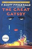 JG: I think it is a project that is too easy to get wrong, too hard to get right, and with not enough room to experiment in between. It is not just this title. There are a number of books that I have found to be not only difficult for students but for professionals as well. The Great Gatsby, On the Road, Catcher in the Rye — have you ever seen a really great cover for any of these books? Certainly, there are iconic covers — Catcher in the Rye’s yellow-type-on-red-background Bantam paperback—but is the actual design that amazing? Not especially, but as an artifact it transcends mere design discussion.
When coming up with projects, I look for titles that can be interpreted a number of different ways (OK, Lolita does fall into this category). Judging by the responses I’ve seen to your project, I may have to rethink this. I also don’t like to give out assignments for projects I am presently or have recently worked on.
JB: What will your next Lolita cover look like?
JG: I really cannot imagine a scenario where I will be designing this cover again.


