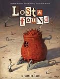
 The work of Shaun Tan, the Australian children’s book illustrator, recalls Terry Gilliam or Tim Burton, but with a mature sad-humored control. It’s a tone that pervades The Lost Thing, an animated adaptation of Tan’s 1999 book of the same name, which won an Oscar at this year’s Academy Awards. It’s the tale of a young man in a post-industrial landscape who discovers a neglected many-tentacled playful cyborg on a beach. This month, that and two of his other older children’s books, The Red Tree (2001), a meditation on loneliness, and the John Marsden-authored The Rabbits (1998), an allegory for the plight of the Aborigine, are enjoying a wide release in America in a one-book compendium Lost and Found: Three by Shaun Tan. These are the kinds of children’s books over which you obsess over the details of the pages’ margins.
Tan, who lives in Melbourne, answered some questions by email.
The Millions: I have heard graphic novelists express surprise at the extreme difference in both form and method between animation and bookmaking. Is there anything that seems amazingly obvious to you now that you didn’t realize before you began making the animated version of The Lost Thing?
Shaun Tan: Yes, I think the main thing is how fast film is. Scenes in a graphic novel can seem to pass slowly and endure a lot of attention, especially wide landscapes and so on. In film, the same images can come across as surprisingly long, and even boring when put on screen (like so many student films!) so our attention works in a different way here. The arrangement of cuts – being the equivalent to comic panel divisions – is also much tighter, with seemingly less room for variation, the flow is too easily jarred by unexpected shifts, and there’s no time for an audience to contemplate discrepancies. In that sense, film is far more conventional in its visual language than illustrated books, and actually a lot more restrictive. I didn’t realize this until tackling it from a production end, and seeing how many things don’t work on screen. It was a real learning curve, but my relative inexperience was useful: we ended up trying things that were a bit unusual – such as some framing devices – and occasionally found that they worked. We also tried to slow things down, whereas 3D animation often favors a brisk, snappy pace.
TM: Going back at least to Yellow Submarine, and probably much further, there has been a long tradition of heavily-detailed works of animation which are constructed in such a way that they can never be fully absorbed on a single viewing. I think your film, The Lost Thing, is part of that tradition. A book, by its very nature, matches a reader’s own particular pace. I can imagine a child being astonished by the film, but then, very carefully, pouring over the details in every corner of the page of your book version. Do you see the book and film serving as counterpoints in this particular way?
ST: You know, I hadn’t really thought about that, but now that you mention it, yes, that’s probably what kids will be doing. Either that, or watching the film multiple times, which was part of my intention. That’s just as true of the book, and all picture books in general: the good ones are meant to be read more than once in order to be properly understood, and the artist takes advantage of the brevity here to insert layers of ideas, one on top of another, rather than set out along a linear string. Our film would possibly not be so effective were it feature-length – too inconvenient to review. But at fifteen minutes, you can at least watch it a couple of times in a half-hour window, and there are enough odd bits in there that encourage a viewer to do this, like revisiting a strange dream. With the Australian DVD release, I also created a special “field guide” to lost things, which includes detailed drawings of a number of creatures glimpsed in the film. I realized that, like myself, a lot of viewers would enjoy spending more time with my original concept drawings.
TM: The aesthetics of the sterile world of The Lost Thing, with its turn-of-the-century newsprint and ubiquitous piping, seems to point to the excesses of the Industrial Age. Yet there is also a disturbing pair of statues in the background of one of your panels which depict a man with the head of a camera talking to a man with the head of a television set. I guess the obvious answer to this observation is that you are creating a timeless universe. But is there any particularly intense love/hate relationship you have with the Industrial Age, the Information Age or any other age that you are wrestling with.
ST: Yes, it’s a kind of love-hate relationship with post-industrial society, but more of a general curiosity too. I think that the age we are all currently living in is absolutely remarkable, it’s so different from our ancestral origins, it’s all happened so rapidly that I feel our older human spirits have not had much time to catch up – and much contemporary art is really a rumination on this problem when you think about it.
The world of The Lost Thing is a very exaggerated one, a frankly negative, cartoon-like distortion, all about the way that artificial living can stifle our imagination, or generate a kind of amnesia. The concrete, signage, numbering and plumbing is really an extension of a deeper crisis, like a visual representation of an apathy and compassion fatigue that threatens all of us. The interesting thing about that totalitarian statue you mention is that the camera and TV are connected, so it’s a feedback loop without any external stimulation (nature is also not present at all, no trees, or even blue skies). It’s quite an important detail for me, and I’m glad you noticed it: it’s about the way people look inwards, and become a slave to their own architecture, something that originally was intended to liberate their lives or make things easier. We see the same thing happening in the world of work: people being subjugated by the very thing that was meant to benefit them and create happiness.
TM: On both these notes, I noticed quite a few points in the margins of your film and the three stories that make up Lost and Found that either quoted or riffed on Heinz Edelmann’s designs for Yellow Submarine. I know that film was particularly influential upon your work, as it has been for a number of illustrators and animators. Could you describe your own sense of Yellow Submarine? There is a way in which your drawings, particularly in The Rabbits, felt brutalistic to a degree that Edelmann and his team would not even attempt to reach.
ST: Yes, that’s interesting. I would also include influences such as Ralph Steadman (Fear and Loathing in Las Vegas), Gerald Scarfe, Milton Glaser, Jim Henson and countless other artists, illustrators, cartoonists and film-makers – they all go into the subconscious pot, so Yellow Submarine was not as directly referenced as you might think (and itself owes a lot to Bosch, the Spanish Surrealists, Lewis Carroll and central European puppetry and illustration). What I like about the world of Edelmann and Peter Max are the dreamlike qualities, where the nature of characters remain inexplicable, and sit somewhere between an adult and childhood imagination: a mixture of cuteness, menace and philosophical puzzles.
TM:Only The Rabbits, which was written by John Marsden, seems to be particularly Australian in its content. (Although Marsden claims in his author’s note that the germ of his allegorical tale comes from an American Indian source.) Your art has an all-swallowing universal quality. But are there any particularly Australian elements in your other two books that I am overlooking?
ST: There are several, there’s a general feeling about the animals that is specifically Australian, even though they are invented species. Things like broad marsupial stripes, the water birds and spindly lizards, tiny flowers. The landscapes are based on Australian examples, the strange desert rocks, based on a formation called The Olgas in our continent’s ancient center. Most Australian readers identify the vivid palette as particularly familiar, where an overseas reader might think of it as seeming fanciful, it’s not as removed from reality as you might think. Our land is a place of extremes: vibrant and muted, fragile and incredibly harsh, prone to devastation and renewal, as we’ve seen with recent floods. When I look at my own paintings, those are the things I recognize, a tough vulnerability, a strangeness of scale. It goes hand in hand with our history of ecological disaster, an ongoing plague of rabbits being one of these, and the fact we have perhaps the highest rate of extinction in the world. Our colonial history is also particularly intense and violent, and largely unspoken due to a lingering racism and denial.
TM: You use empty desert-like landscapes to depict loneliness in The Red Tree. But you use less obvious visual stimulations as well. A giant deathly fish hovers over the heroine as she walks the streets. At one point she stands below a structure that seems to have been pulled off the set of Metropolis, as the world is described as a “deaf machine.” How many visual metaphors for the varying qualities of loneliness did you work through before you settled on these?
ST: Many, all of which are played around with in my sketchbooks. I wanted to have a good variety there, ranging from natural to urban elements, big things and small things, to really avoid any patterns forming. Part of the idea behind that book is that it is very dreamlike, and resists a logical interpretation, so the reader can only make an emotional assessment. I am sometimes frustrated when readers keep looking for “meaning,” as if every story has a fixed set of answers, so I wanted to create a book that obviously has none – only whatever you can bring to it using your own imagination.
TM: The lost thing of your film felt far more human than the humans. I didn’t have the same immediate sensation when reading the book version. Were you conscious of this change between the film and the book?
ST: That’s a very interesting observation and well put. No, I have to say I was not conscious of that, but it makes good sense that it turned out that way! In some respects, the film is a refinement of the separated universes you see in the book, the “human world” and “utopia” (the name we gave to the land of lost things). The irony here is that the human world is dehumanized, and the world of utopia is far more attractive for us. In digital animation, it’s often difficult to make humans move naturally, and so we used that to our advantage: my brief was always “make the people wooden.” In contrast, the lost thing was meant to seem very lively, and awake to its environment, just as the viewer or reader is. Although it has no face, can’t speak and is incredibly strange, we identify with the creature more than our human counterparts in this bleak world.
TM: There is a deep melancholy in The Lost Thing’s conclusion that feels even stronger in the book than in your film. It sounds like a meditation on the pain of growing older. I wonder if that pain is particularly acute in childhood, during which so much changes so quickly and so much is quickly lost.
ST: That’s a good point: yes, I think that’s true. For adults, personal childhood objects tend to evoke a mixture of joy and sadness, which is a combined feeling that I really like, it feels very “full” and well-rounded. I don’t think you can really have one without a bit of the other, they define each other like complementary colors.
TM: How much are your books about adults? How much are they about children? Is there a difference?
ST: They are about both, given that every adult was once a child, and every child is heading, unavoidably, towards adulthood. I think too much is often made about the differences between age groups. For me the ideal state is to take the best of both worlds, something that every artist tries to do I think: the open-mindedness and innocent eye of a child, combined with the wisdom and experience of an adult. I think art and literature are such a great means of examining that intersection, and getting us to pay attention to all “lost things,” whatever that might mean.
llustrations from Lost & Found: Three by Shaun Tan copyright 2011 by Shaun Tan. Used with permission from Scholastic Inc. / Arthur A. Levine Books.


